
Think of Coca-Cola's red, Apple's black, or Starbucks' green. Those colors are not decoration. They are part of how people recognize the brand and how they feel about it. Color psychology is the practice of choosing hues that support that response on purpose.
If you are picking a palette for a brand or a product interface, start with the emotion you want, then check culture, industry norms, and competitors before you commit. The goal is a clear message, not a pretty guess.
What color psychology means
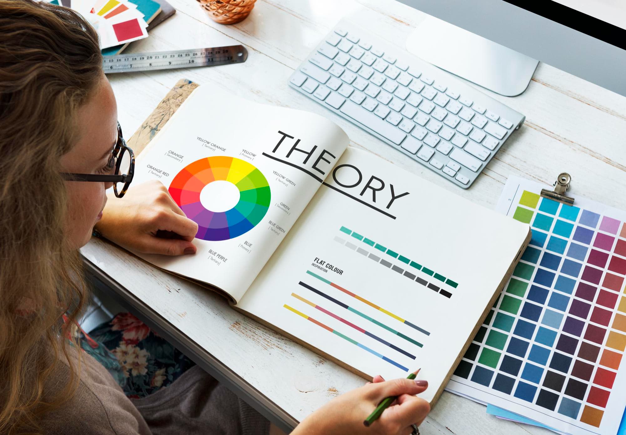
Color psychology studies how shades affect emotion, behavior, and decisions. The responses are real but not universal. Personal history, culture, and plain preference all change how a color lands with a given person.
That matters for how you use it. Color psychology is a way to make a deliberate choice and improve your odds of sending the message you intend. It is not a formula that produces one correct answer for every brand in a category.
In branding and design, the practical use is alignment: picking hues that carry the message you want and build an emotional response that matches the brand's identity. It is one example of why design matters in everyday life, often shaping a response before someone reads a word.
What common colors usually signal
These readings are common in Western branding. Treat them as starting points, not rules.
Red. Energy, passion, excitement, and urgency. Coca-Cola and Netflix use red when they want attention and intensity. It is a color that pushes rather than reassures, which suits some categories and works against others.
Blue. Calm, trust, reliability, and productivity. Facebook and LinkedIn use blue to signal steadiness and trustworthiness, which is why it shows up so often where people are asked to hand over data or time.
Yellow. Happiness, optimism, and warmth. McDonald's and Nikon use yellow to feel open and positive.
Green. Calm, growth, well-being, and environmental care. Starbucks and Whole Foods use green to support healthy and eco-friendly positioning.
Black. Sophistication, luxury, and exclusivity. Chanel and Prada use black to underline premium status, where restraint signals more than decoration would.
Meaning also shifts by culture and audience. Red can read as lucky in China and as warning or danger in many Western contexts. The same hue can carry opposite associations depending on who is looking, so always test color against the people you actually serve.
Why color matters in branding
Color earns its place in brand strategy for a few concrete reasons.
Recognition. Color can raise brand recognition by up to 80%, which makes it central to how people identify and remember a brand. It often registers before a logo or a name does.
Emotion. The right palette shapes attitude toward a product or service and can influence buying decisions. A color that fights your positioning creates friction the copy then has to overcome.
Differentiation. A distinct color system helps you stand apart in a crowded category, especially when the products themselves are similar.
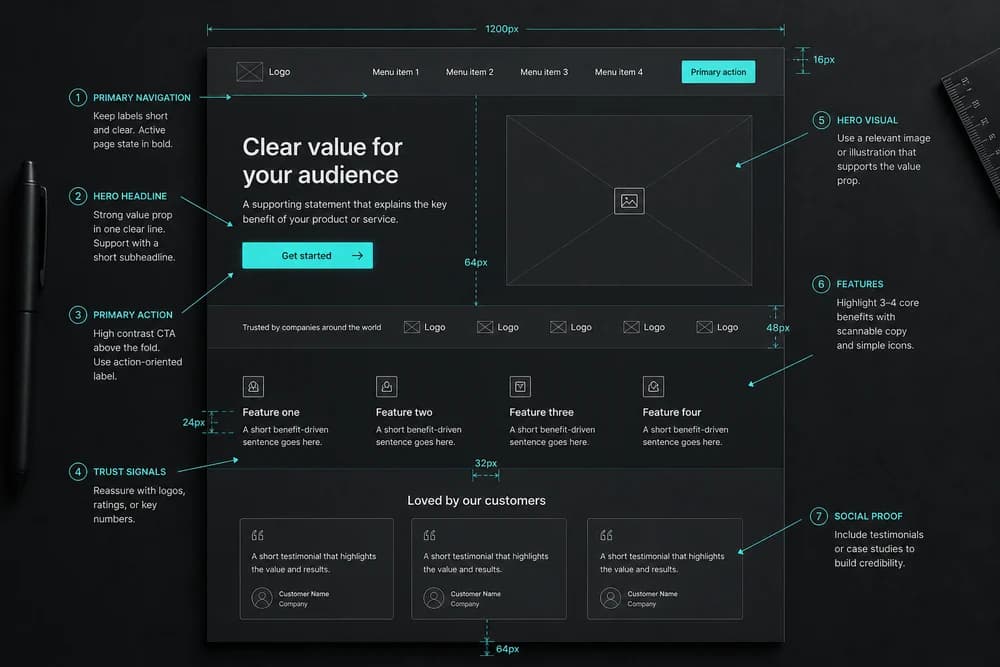
User experience. In digital design, color builds hierarchy, directs attention, and supports clear navigation. It tells people what is clickable, what is important, and what is only context—one reason UX matters more than looks in web design.
Color as a UX tool, not just a brand asset
In an interface, color has a job beyond identity. It separates primary actions from secondary ones, groups related elements, and marks states such as success or error.
That is why a brand palette usually needs an interface palette around it. If your brand color is also the color of every button, every alert, and every heading, none of those signals stand out. Reserve the strongest hue for what you most want people to do.
Keeping color consistent across screens matters as much as the choice itself. When the same color means different things in different places, people stop trusting it as a cue and slow down.
How to choose the right colors
Do not pick colors only because they look good. Treat the decision as strategy and work through four checks.
Brand personality. Decide what people should feel in the first few seconds. Energy and urgency, calm and reliability, and quiet luxury pull toward different parts of the spectrum, so name the feeling before you open a color picker.
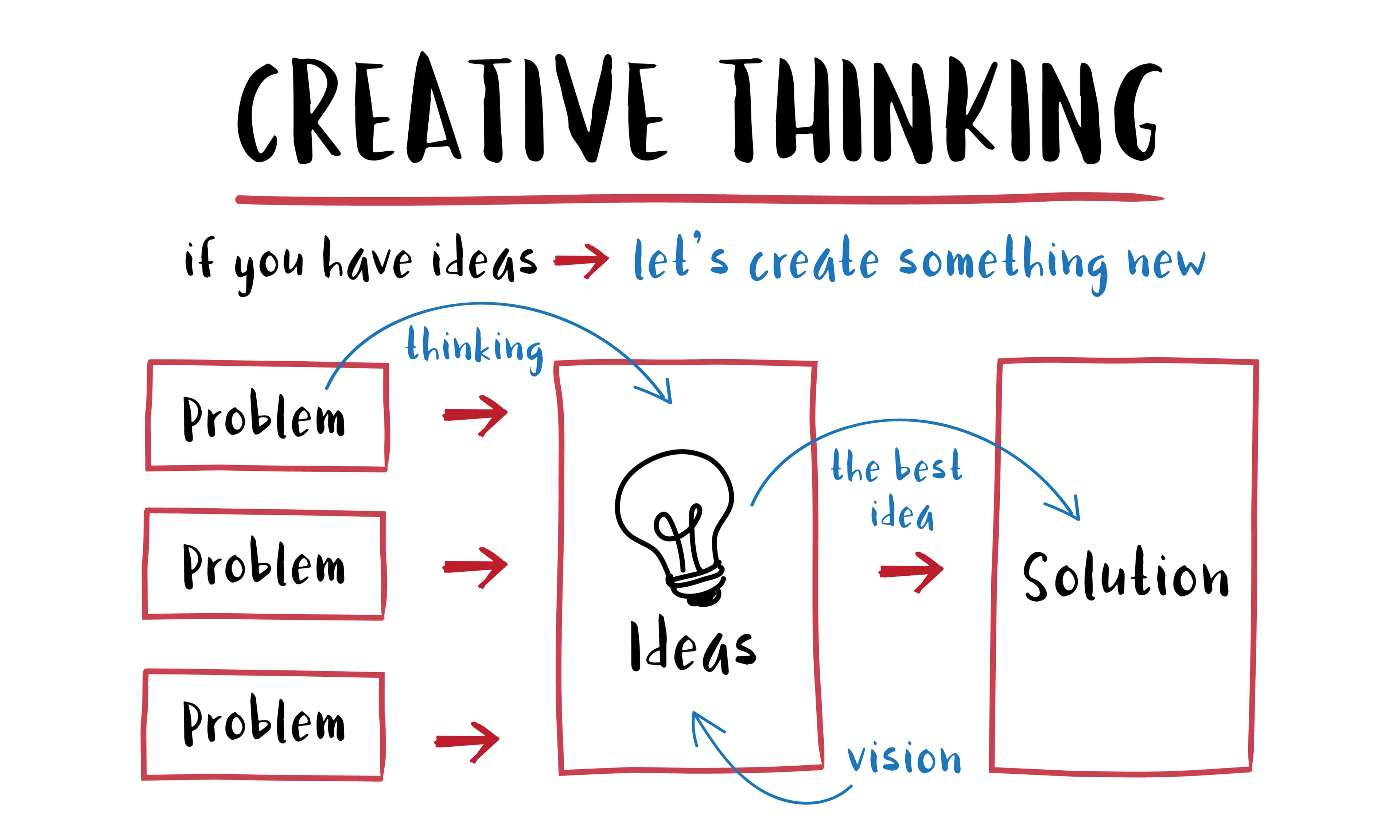
Target audience. Age, culture, and context change meaning. If your audience is mainly in Asia, map cultural color meanings before you lock the palette rather than after launch. Researching that audience first follows the empathize stage of the design thinking process.
Industry norms. Tech often uses blues, greens, and grays to suggest trust and innovation. Luxury often leans on black or gold for elegance. Norms exist because audiences have learned them, so breaking one should be a decision, not an accident.
Competition. Match enough to feel credible in your category, differ enough to be memorable. Landing on the same blue as the market leader makes you look like a smaller version of them.
Run the result back through your positioning before you commit. A software brand built on heavy luxury black fights what buyers expect from software. A premium fashion label in soft pastel blue undercuts the exclusivity it is selling. In both cases the palette is fine in isolation and wrong for the job.
Closing note
Color is part of brand strategy, not a finishing touch. Choose hues that match your personality, speak to your audience, and set you apart from competitors, then use them consistently enough that people learn what they mean.
Every palette tells a story. Make sure yours matches the brand you want people to remember.