
A brand color palette is a short list of hues with jobs: one color people remember, a few that support it, and neutrals that keep text readable. Picking "colors you like" is how sites end up with five competing buttons and no clear action.
This is for founders, freelancers, and juniors who need a palette they can use on a site, not a 40-swatch mood board. If you want the meaning of common hues first, start with Color Psychology in Branding and Design. This article is the decision process after that.
Name the feeling before you open a picker
Write one sentence: "When someone lands on this brand, they should feel ."
Examples:
Calm and trustworthy (often cooler blues and plenty of neutral space)
Direct and urgent (often a strong warm accent, used sparingly)
Quiet and premium (often dark neutrals, restrained accent)
If you cannot name the feeling, you will argue about hex codes forever. The feeling is the brief. Color is the execution.
Start with one primary color
The primary is the color you would still recognize if the logo were gone: a header stripe, a key button, a product shot background.
Rules that keep you out of trouble:
Pick one primary, not three "mains."
Check it on white and on a dark background if you use both.
Ask whether it already belongs to the obvious competitor in your category. If it does, you will look like a smaller copy of them.
You do not need a rare color. You need a color you can repeat without it becoming noise.
Add support colors with jobs
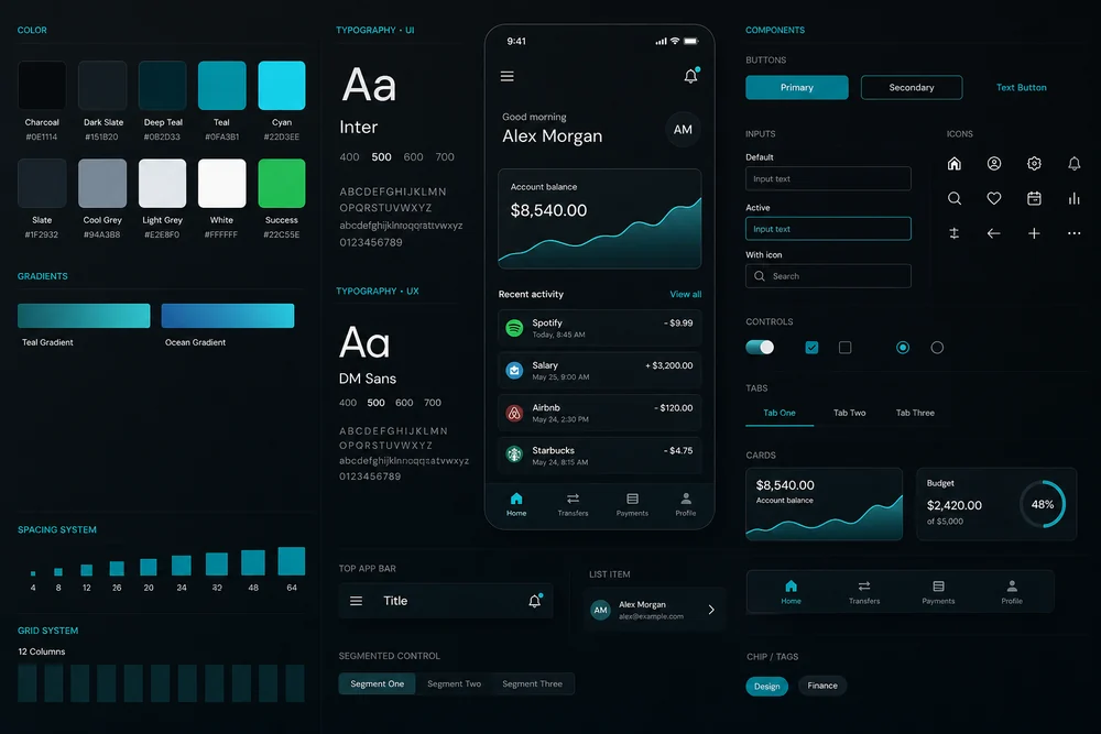
A workable small palette:
Role | Job |
Primary | Recognition and main actions |
Secondary | Supporting sections, charts, or alternate buttons |
Neutrals | Backgrounds, text, borders |
Semantic (optional) | Success, warning, error |
If a swatch has no job, drop it. Palettes fail when every color wants to be special.
Build neutrals like a type scale
Most of the screen is not the brand color. It is gray, off-white, or near-black.
You typically need:
A page background
A surface color for cards
A strong text color
A border color
A muted text color
Test body text on the background. If you have to squint, the brand hue does not matter yet. Readability is the floor.
Check contrast where people click and read
Buttons, links, and small labels fail first.
Primary button text must stay readable on the button fill.
Links should not rely on color alone if the contrast is weak.
Error red still has to work for people who see color differently. Pair it with an icon or text, not color only.
This is hierarchy and UX, not decoration. A pretty primary that fails as a button fights Why UX Matters More Than Looks in Web Design.
Run four filters before you lock it
Audience. Meanings shift by culture and age. If your readers are not the same as a Western brand you admire, do not copy that palette blindly.
Industry. Software often lives in blues and grays because buyers have learned that language. Luxury often uses restraint. Breaking a norm is fine if you can say why.
Competitors. Open five sites in your category. If they all use the same blue, your blue will not differentiate you. Match enough to feel credible, then differ in one controlled way (accent, not chaos).
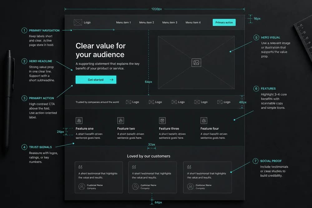
Real UI. Drop the colors onto an actual layout: header, body, one form, one primary button. If the page still has no rank, fix hierarchy with size and space. Visual Hierarchy in Web Design is the layout half of this.
A practical selection sequence
Write the feeling in one sentence.
Choose one primary that fits that feeling and is not the clone of your top competitor.
Choose neutrals that make long text comfortable.
Add at most two supporting colors.
Assign jobs (button, link, background, alert).
Test on a phone-width layout.
Cut any color you did not use.
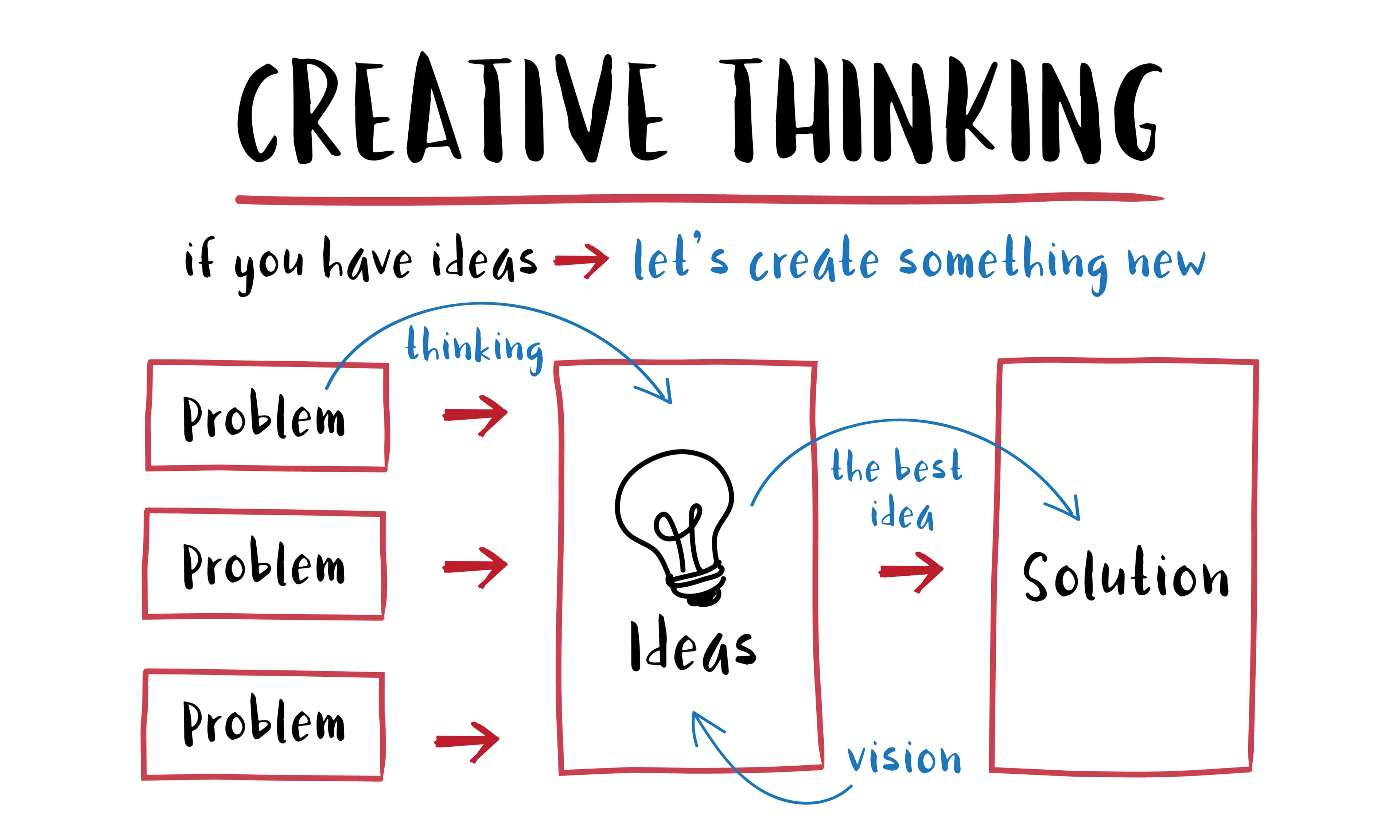
If the team is stuck arguing taste, go back to the user problem, not the swatch. That is the same discipline as 7 Design Thinking Principles Explained: define the job, then test a rough version.
Mistakes to avoid
Using the brand color on every heading, button, and alert
Building a palette from a random generator and never testing type on it
Copying a palette from a fashion lookbook that will never appear in a form
Skipping dark text on light backgrounds because dark mode "looks cooler"
Treating color as the whole brand. Type and space do as much work. See Typography Basics for Non-Designers once the palette is stable.
Closing takeaway
Lock a small palette with jobs, not a large palette with opinions. One primary, readable neutrals, and a single strong place for the accent will take you further than another week of exploring swatches. Put it on a real page, then only keep the colors that still have a role.