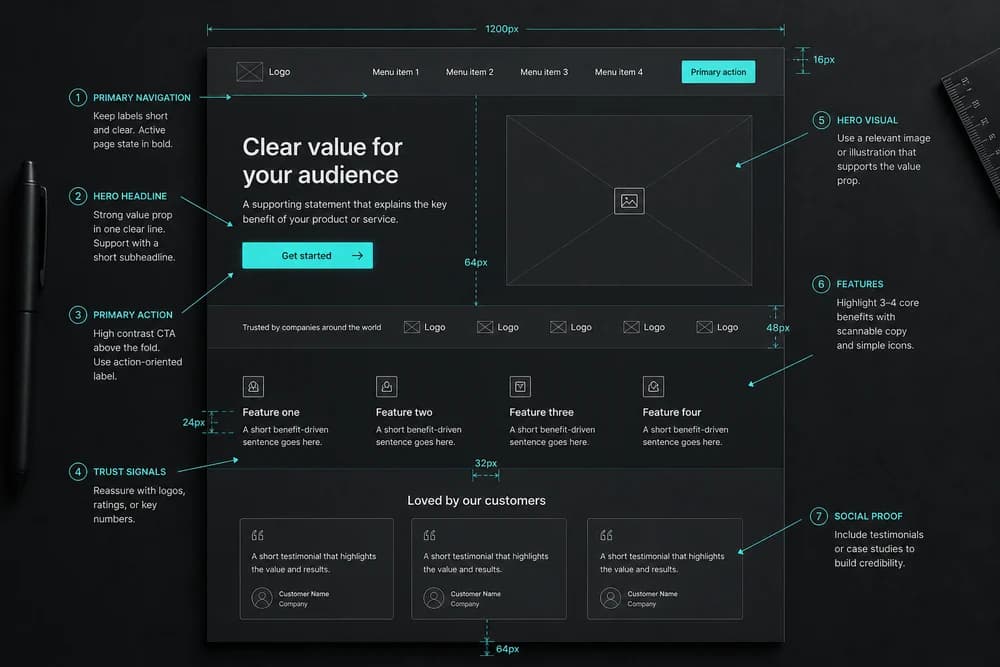

A good-looking site still fails if people cannot find what they need, finish a task, or trust what they see. In web design, user experience (UX) is the work of making a site usable, efficient, and accessible so visitors stay and act. Looks help. UX decides whether the site works.
That is not an argument against visual design. It is an argument about order: make the path clear first, then make it look the way the brand should look.
What UX means in web design
Cognitive scientist Don Norman popularized the term "user experience" while at Apple. He used it to describe the full interaction a person has with a company, its products, and its services, not just the look of an interface.
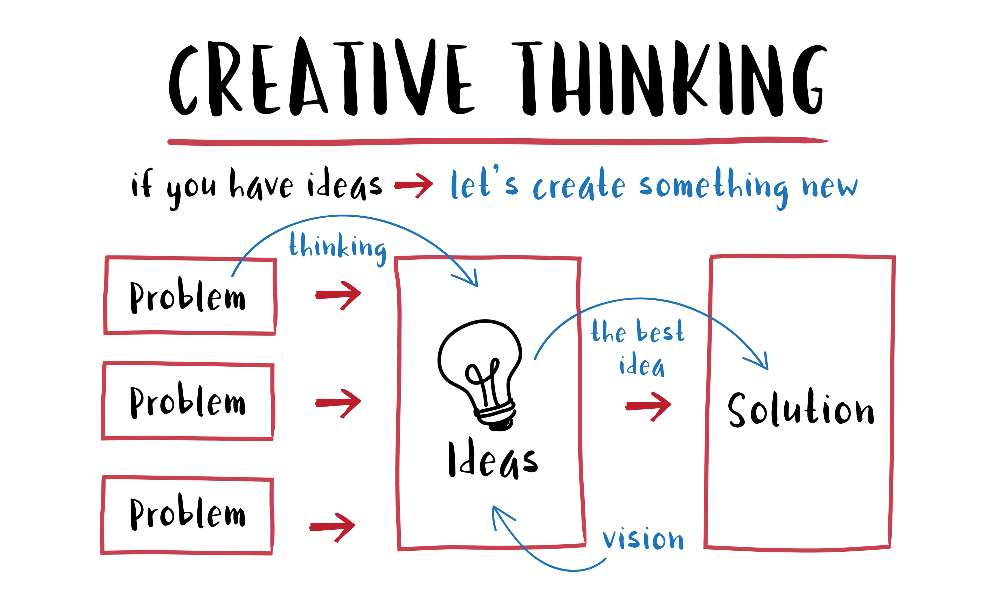
On the web, that means designing for how people move through pages, find information, and complete goals. Strong UX makes a site easier to understand, faster to use, and clearer for more people. A structured way to uncover those needs is to apply the seven design thinking principles.
Practically, it covers decisions that never show up in a mockup review: what the menu labels say, what the page structure implies, how many steps stand between arriving and acting, and what happens when something goes wrong.
Why UX matters
Retention and conversion
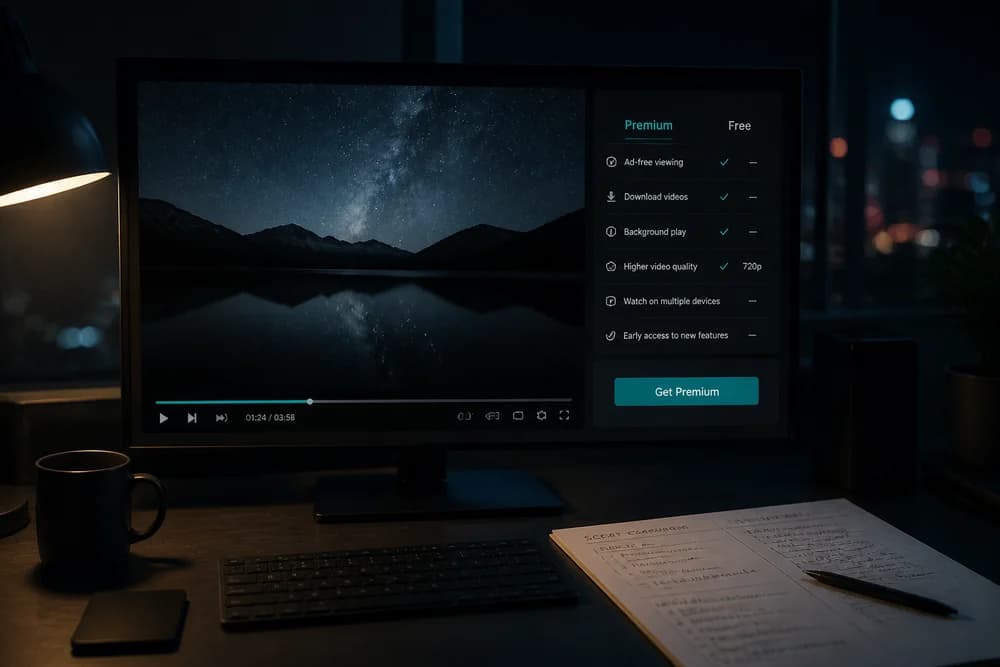
Most sites exist to attract attention and turn it into action: a signup, a purchase, a contact form, or a share. Clear navigation, short paths to key actions, and fewer dead ends help people stick around and finish what they came to do.
The reverse is just as direct. When the next step is unclear, people leave rather than work it out, and the visual polish of the page does not save the visit.
Accessibility
Inclusive UX helps people of different abilities use the site. That expands who you can reach, supports better findability, and helps you meet accessibility requirements that apply in many countries.
Treating this as a compliance task at the end usually means retrofitting structure, labels, and contrast decisions that would have been cheaper to get right during design.
Brand trust
People judge a brand by how the site feels to use. Confusing menus, broken flows, or unclear messaging erode trust. A smooth, reliable experience does the opposite: it makes the brand feel credible.
This is the part visual design cannot carry alone. A polished page attached to a broken flow reads as careless, not premium.
Core UX principles for web design
Use these as a checklist when you plan a new site or review one you already have.
Usability
Give people clear paths. Menus, labels, and page structure should make the next step obvious without guesswork.
When you write a label, prefer the word the visitor would use over the word your team uses internally.
Value
Offer something worth the visit: useful information, a tool, a service, or content that answers a real need. Pretty pages without value do not hold attention.
If a page cannot answer "what does the reader get here," it usually needs content work rather than a redesign.
Accessibility
Design so more people can use the site, including people with disabilities. Treat accessibility as part of the product, not an afterthought.
That includes readable text, meaningful headings and labels, and flows that do not depend on one way of interacting.
Desirability
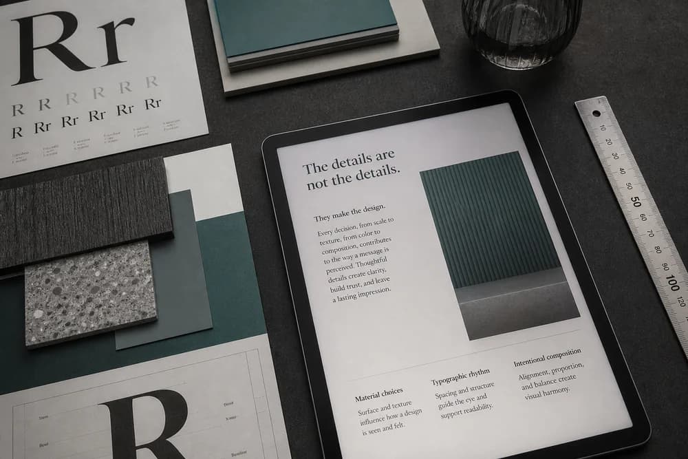
Visual identity, imagery, and tone should create a positive response. Design should support clarity and emotion, not distract from the task. Used deliberately, color psychology in branding and design can help align that response with the brand.
This is where looks earn their place. Desirability is a real principle, but it works alongside usability instead of replacing it.
Credibility
Users need reasons to believe what the site says. Consistent design, clear messaging, and reliable behavior all reinforce authenticity.
Inconsistency is the common failure: different patterns for the same action, or claims on one page that the rest of the site does not support.
How to review a page against these principles
Pick the single job a visitor comes to that page to do, then walk it yourself without shortcuts.
Note every point where you had to pause and decide what to click. Each pause is a usability problem, not a user error.
Check whether the page states its value in the first screen, before any scrolling.
Check the flow without relying on visual cues alone: are headings, labels, and controls understandable on their own terms?
Look for consistency with the rest of the site. Same action, same pattern, same words.
Fix the pauses and gaps before you revisit colors, spacing, or imagery. Styling a confusing flow makes it prettier, not usable.
What goes wrong when looks lead
Menus that read well in a design file but not to a first-time visitor. If the label only makes sense once you already know the site, it is decoration standing where a signpost should be.
Flows that were never walked end to end. Individual screens can each look finished while the path between them has a gap nobody clicked through.
Visual interest that competes with the task. Imagery and motion are meant to support clarity and emotion, so anything pulling attention away from the next step is working against the page.
Pages with nothing worth the visit. No amount of styling substitutes for information, a tool, or a service the visitor actually needed.
Accessibility left until the end. Once structure and labels are locked, fixing them costs more than designing them properly would have.
Where UX is heading
Newer interfaces keep expanding what UX covers. Voice user interfaces (VUI), augmented reality (AR), and artificial intelligence (AI) open new ways to interact.
They still depend on the same foundation: understand the user's goal, then remove friction. The medium changes the constraints, not the underlying job—and that broader impact helps explain why design matters in everyday life.
Practical takeaway
Start with the user's job to be done. Make the path obvious, keep the experience inclusive, and make the site feel trustworthy enough to act on. If you only have time for one change this week, walk your most important task path and remove the step where people have to guess.