Design is the intentional work of shaping how things look, work, and feel so people can solve problems with less friction. It is not only decoration. Good design improves usability, clarifies choices, and can change how a product, space, or message lands.
You meet design all day, often without noticing it: the clothes you wear, the layout of a room, the flow of an app, the packaging on a shelf. Below is where it shows up, and what it is actually doing in each case. When you build digital products, the same idea applies: clearer tasks beat prettier screens. That is why Why UX Matters More Than Looks in Web Design sits next to this topic.
Fashion and personal style
Fashion design balances appearance, function, and cultural context. Clothes need to fit real bodies, suit real use, and signal identity or belonging. Haute couture and streetwear both use the same core job: turn materials and form into something people want to wear and can use.
When fashion fails as design, the problem is rarely "not trendy enough." It is friction: hard to move in, hard to care for, or mismatched to the weather and the task. That same test applies to digital UI: if it looks sharp but blocks the job, it failed.
Architecture and interiors
Architecture shapes buildings and cities with function, appearance, and environmental impact in mind. Interior design then tunes layout, color, and furniture so a space supports how people actually move, work, and rest. The goal is not only a nice room; it is a space that works.
Circulation paths, light, storage, and seating are design decisions. Empty floor that does nothing for movement is wasted space. Crowded furniture that blocks doors is clutter. The parallel on a landing page is clear: space should group related things and separate unrelated ones. See How to Use White Space in Web Design.
Technology and user experience
In digital products, UI and UX design decide whether people can find what they need and feel confident doing it. Clear interfaces, accessible patterns, and thoughtful flows raise usability and satisfaction. That usually means better adoption and fewer abandoned tasks.
UI is what people see and tap. UX is whether the whole path makes sense. If you need the distinction in plain language, read UI vs UX: What's the Difference?.
Hierarchy and spacing are how digital design does everyday work:
Size and weight rank what matters first (Visual Hierarchy in Web Design: A Practical Guide)
Line height and paragraph gaps keep reading possible (Line Height and Spacing: Make Text Easier to Read)
Margin and padding keep boxes usable (Margin vs Padding: What's the Difference?)
None of that is decoration. It is how people complete a task without fighting the screen.
Product development
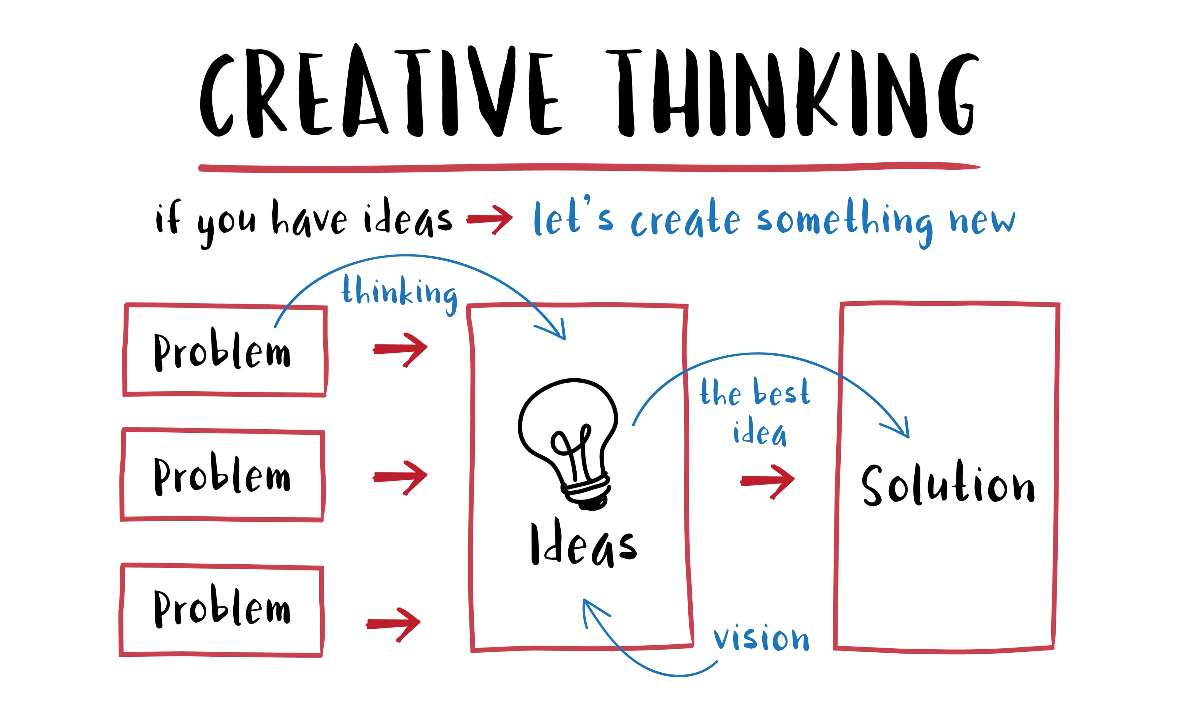
Industrial design connects form and function. Designers weigh human needs, ergonomics, and aesthetics so a product is usable and appealing. Design thinking methods push teams to define the problem, test ideas early, and stay focused on the customer instead of shipping features in isolation.
The useful habit for builders: define the job before you add chrome. A feature that looks complete in a mockup can still fail in a user's hand. Test early with the real task, not only with opinions about style.
Communication, branding, and persuasion
Graphic design, typography, and visual storytelling carry meaning faster than text alone. In advertising, layout, imagery, and copy work together to get attention, explain a benefit, and persuade. Weak visual hierarchy buries the message; strong hierarchy makes the point obvious.
Brand color is part of that system. Color choices affect recognition and mood, but they still have to support reading and action. For a practical palette pass, see How to Choose a Brand Color Palette and Color Psychology in Branding and Design. For type that non-designers can set without guessing, use Typography Basics for Non-Designers.
On a landing page, design fails when everything shouts. One job, one primary action, less competing chrome: How to Reduce Clutter on a Landing Page.
Art and visual expression
Artistic design uses visual principles to carry emotion, narrative, or social commentary. Paintings, sculpture, installations, and multimedia work still rely on composition, contrast, and structure so the piece communicates, not only decorates.
Even here, structure is not the enemy of creativity. Contrast, grouping, and focal points are how the viewer knows where to look. Digital screens use the same tools with different constraints.
Transportation and urban planning
Automotive design weighs safety, aesthetics, and aerodynamics so vehicles perform and still feel intentional. Urban planning applies design principles to streets, transit, and public space with sustainability, accessibility, and quality of life as constraints, not afterthoughts.
Accessibility is not a niche concern. Curb cuts, clear signage, and readable maps help more people than the original brief sometimes planned for. The same pattern shows up in web design: clearer defaults help everyone, not only edge cases.
Environmental sustainability
Sustainable design aims to use fewer resources, create less waste, and choose lower-impact materials and systems. That can mean packaging that is easier to recycle, buildings that use less energy, or products designed for longer use. The design choice itself is part of the environmental outcome.
For digital work, sustainability also shows up as restraint: fewer unnecessary pages, lighter assets, and interfaces that help people finish without endless loops. Clutter is not only visual noise; it is wasted attention.
Education and learning
Instructional design shapes courses, materials, and learning platforms so people can follow, practice, and remember. Clear structure, useful feedback, and reduced cognitive clutter improve retention and motivation more than packing more content onto a page.
If a lesson page feels hard, check hierarchy and spacing before you add another widget. Readers need a path, not a pile.
Health and well-being
Healthcare environments, medical devices, and wellness products all depend on design for comfort, safety, and clarity. Patient-centered spaces and ergonomic devices reduce friction and error. Usability here is not a nice-to-have; it affects outcomes.
Error-proofing, readable labels, and calm layouts matter when stakes are high. Consumer apps can borrow the same seriousness: make the destructive action harder to hit by accident, and make the main action obvious.
Social and cultural context
Design both reflects culture and shapes it. Symbols, traditions, and values show up in what gets made and who feels represented. Inclusive, culturally aware design supports relevance and belonging instead of forcing one default audience.
Default assumptions (one language, one body size, one reading level, one device) create friction for everyone outside that default. Good everyday design widens who can use the thing without asking them to adapt first.
A practical check you can use anywhere
Design will keep showing up in ordinary decisions. When you next pick an app, a chair, a course, or a campaign layout, ask:
What job is this supposed to help me finish?
Does the layout make that job obvious?
Where is the friction: finding, understanding, or acting?
What would I remove before I add anything?
If you are reviewing your own site with that lens, walk it with How to Review Your Own Website for UX Issues.
Closing takeaway
Design matters because it changes how hard everyday tasks feel. Looks are part of it. Clarity, usability, and respect for real constraints are the rest. If you only change one thing this week, pick one product you use daily and name the single design choice that either helps or blocks the job.