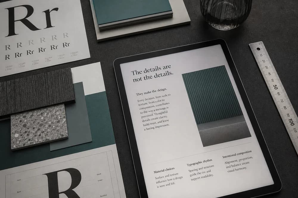
Typography is the craft of setting words so they can be read and ranked. For a website, that means a clear heading, comfortable body text, and enough difference between the two that the page has a voice without shouting.
You do not need to become a type designer. You need rules you can apply to a blog, a landing page, or a client site this week.
Type is one of the main tools in Visual Hierarchy in Web Design. It is also part of why ordinary things feel easy or hard to use, the same thread as Why Design Matters in Everyday Life.
The three roles on a page
Most pages only need three roles:
Display / heading: the page title and section titles
Body: paragraphs and lists
UI / meta: nav, captions, captions, form labels, dates
If heading, body, and buttons all share one size and weight, you do not have type. You have a wall of text.
Pick fonts by job, not by mood board
Body first. Choose a face that stays clear at small sizes. Neutral serif or sans is fine. Avoid thin hairline fonts for long reading.
Headings second. You can use a heavier weight of the same family, or a second family with more character. The heading should still be readable on a phone.
Pairing. Two families is a ceiling for most sites. Pair contrast of role (a distinct heading, a quiet body), not two decorative faces competing.
Skip novelty fonts for paragraphs. They tire people and often fail at small sizes.
Set a small type scale and stick to it
A usable scale might be:
H1: largest, used once per page
H2: clearly smaller than H1
Body: one size
Small: captions and helper text
Do not invent a new size for every section. Inconsistency is what makes a site feel accidental.
Line length matters as much as size. Very long lines are hard to track. A comfortable reading column (not full-bleed paragraphs on a huge monitor) is part of the design, not a CSS afterthought.
Line height, spacing, and alignment
Body line height should feel open, not cramped. If lines touch, raise line height before you change the font.
Space after a heading should be less than the space after the section. The heading belongs to the text below it.
Left-align long body text. Centered paragraphs look like a greeting card and slow reading.
Keep enough contrast between text and background. Pale gray on white is a common failure.
Color and type work together. A brand hue that cannot carry small text belongs on buttons, not on paragraphs. See How to Choose a Brand Color Palette.
Hierarchy is a type job
Readers should know the page title from a section title from a caption without thinking.
Checks:
Only one H1
H2s look related to each other
Links are visible in body text without looking like buttons
Quotes and lists are still part of the same family, not a third font
If you need the UX argument for why this order matters, use Why UX Matters More Than Looks in Web Design. Type is how the path is labeled.
Web-specific habits
Prefer fonts that render well on screens. Extreme contrast serifs can fall apart at small sizes.
Limit all-caps to short labels. All-caps paragraphs are slower to read.
Do not stretch or squash letterforms to fit a box. Change size or copy instead.
Test the actual content. "Heading" in a mock is shorter than your real H1.
A one-page checklist
Open your homepage or a long article and fix, in order:
One H1, readable on a phone
Body size comfortable without pinch-zoom
Line height that does not collide
Heading weight clearly stronger than body
Link style distinct from body, not a second rainbow
Enough contrast for body and small labels
No extra display font on random words for "emphasis"
If the page still feels noisy after type is calmed, the problem may be layout rank, not type. Go back to hierarchy.
When you are choosing type as part of a wider identity, keep the same discipline you use for color: few choices, clear jobs, then test on a real page. Color Psychology in Branding and Design helps with the feeling. Type carries the words.
Closing takeaway
Set body text so people can read it, then make headings clearly more important than body. Stop there until those two jobs are obvious on a phone. Fancy pairing is optional. Readable rank is not.