Visual hierarchy is the order in which a page is noticed. If the headline, the main action, and supporting text all shout at the same volume, people pause. That pause is not a user error. It is a layout problem.
This guide is for people who ship pages: juniors, freelancers, and founders reviewing their own site. It is not a theory of perception. You should be able to open a live page after reading and change what stands out first.
Looks still matter, but they should serve the path. If you need that argument first, read Why UX Matters More Than Looks in Web Design. Hierarchy is one of the practical ways UX shows up on the screen.
What visual hierarchy is for
People do not read a webpage like a book. They scan. Hierarchy decides:
What they see first
What they understand the page is for
Where they click if they want to continue
A page with a strong hierarchy feels calm even when it has a lot of content. A weak one feels busy even when it has little.
This is also why design shows up in ordinary choices, not only in portfolios. The same idea appears in signs, packaging, and apps, which is the point of Why Design Matters in Everyday Life.
The five levers you actually use
You do not need ten tools. These five do most of the work.
Size
Larger type and larger blocks read as more important. Use size for the page title and the primary button. Keep body text in one comfortable size. If everything is large, nothing is.
Contrast
Dark on light (or the reverse) is the baseline. Then use one stronger color for the main action. If every button uses the brand color, none of them is the action. That is the same trap described in Color Psychology in Branding and Design: a hue that is everywhere stops working as a cue.
Spacing
Space is a ranking tool. More space around an element makes it feel more important. Tight groups say "these belong together." If a heading sits on top of a paragraph with no gap, it stops being a heading and becomes a caption.
Type
Weight, size, and case create a type scale: one H1, a few H2s, body, then small labels. If you need a type primer before you set that scale, use Typography Basics for Non-Designers.
Position
People often start near the top and the first strong block. Put the promise and the primary action where a first-time visitor will find them without hunting. Do not bury the only useful button under three similar cards.
A simple page order that works
For most landing pages and article headers, this order is enough:
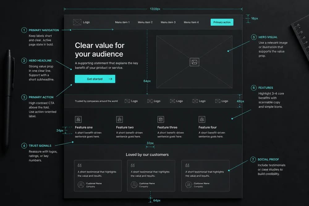
Page title (what this is)
One supporting line (who it is for or what they get)
Primary action (if the page has one)
Supporting proof or details
Secondary links
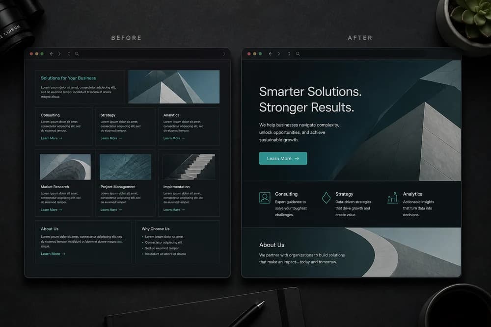
If your layout skips from a decorative image to a grid of equal cards, you have no order. You have a pile.
How to check a page in five minutes
Open the page on your phone. Squint, or step back from the monitor.
Ask:
What is the first thing I can still read?
Is that the thing I want people to do or understand?
Are there two or three things competing at the same size and color?
Does the primary button look more important than "Learn more" links?
If the first readable thing is a nav item, a stock photo, or a sidebar, fix that before you restyle anything else.
For a fuller walkthrough that includes labels and task paths, use How to Review Your Own Website for UX Issues. Hierarchy is the visual half of that review.
Common mistakes
Everything is a headline. When H2s, buttons, and prices all share the same size, the page has no rank.
Too many accent colors. One accent for actions is easier to learn than five "important" colors.
Equal cards everywhere. A grid of identical modules is fine for a catalog. It is a poor hero. One module should lead.
Decorative motion in the way. Animation that pulls the eye away from the next step is working against hierarchy.
Ignoring the first screen. If the job of the page is not stated before a scroll, many people never see it.
A short build checklist
Before you call a layout done:
One clear H1 that matches the search or ad that brought people here
Body text smaller and lighter than the title
One primary button, visually stronger than secondary links
Consistent gaps between sections (do not invent a new spacing for each block)
Images support the promise instead of competing with it
If you are still choosing colors for that primary button, do it with a plan, not a favorite swatch. How to Choose a Brand Color Palette covers that decision.
When hierarchy and brand fight
A luxury palette that is all muted gray can make buttons disappear. A loud palette can make every block feel like an ad.
In both cases, keep brand color, but change rank with size and space first. Color is a signal. Size and space are the structure.
Closing takeaway
Pick the one thing a visitor should notice first. Make it larger, clearer, and more isolated than everything around it. Then rank the rest. If you only change one page this week, start with your most important landing page and remove the second thing that currently shouts as loud as the first.