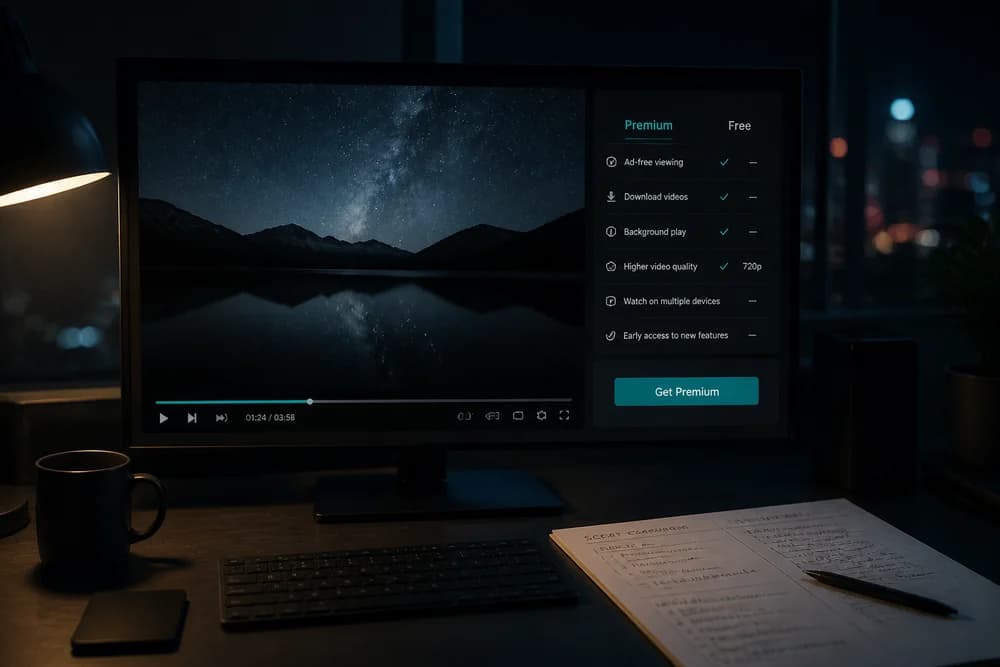
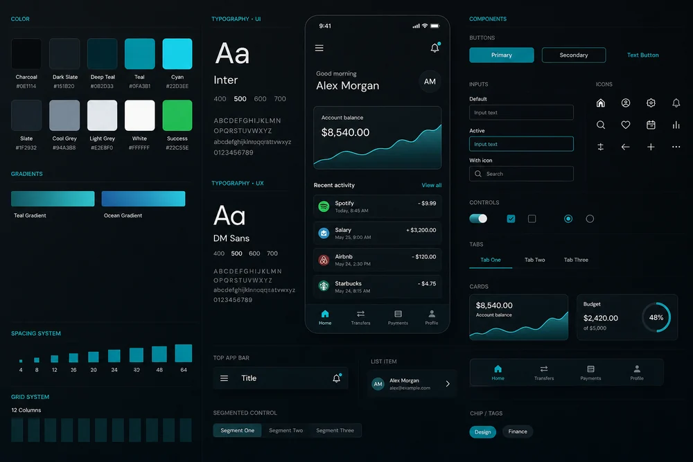
UI is what people see and click: layout, type, color, buttons, and spacing. UX is whether that journey works: can they find the thing, trust it, and finish the task without guessing.
They overlap. They are not the same job. Mixing the words is how teams spend a month on a new look and still have a broken signup.
If you already believe looks should not lead, Why UX Matters More Than Looks in Web Design is the longer case. This article is the split: what to call what, and what to fix first.
A plain definition
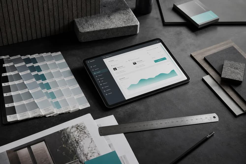
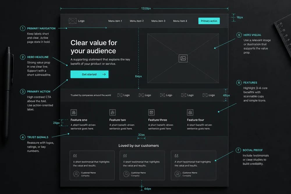
User interface (UI) is the designed surface. Screens, components, visual hierarchy, and the controls in front of someone.
User experience (UX) is the whole interaction around a goal. It includes UI, plus information architecture, content, performance, accessibility, and the feeling of "this was straightforward" or "I got stuck."
A restaurant analogy: UI is the menu, plates, and lighting. UX is whether you got seated, understood the options, received the right dish, and would come back.
What UI work looks like
UI decisions you can point at:
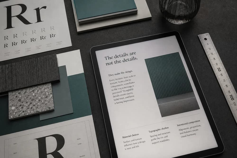
Type scale and alignment
Color used for actions versus decoration
Spacing and visual hierarchy
Button styles, forms, and empty states
Consistency of components across pages
If two pages use different patterns for the same action, that is an UI consistency problem, and it also becomes an UX problem because people have to relearn the site.
Color is an UI tool with UX effects. A palette that cannot rank a button fails both. See How to Choose a Brand Color Palette and Color Psychology in Branding and Design.
What UX work looks like
UX decisions you can test without opening a design file:
What is the user's job on this page?
How many steps to complete it?
Are labels in the visitor's words?
What happens when the form fails?
Can someone do this without a mouse, or with a screen reader?
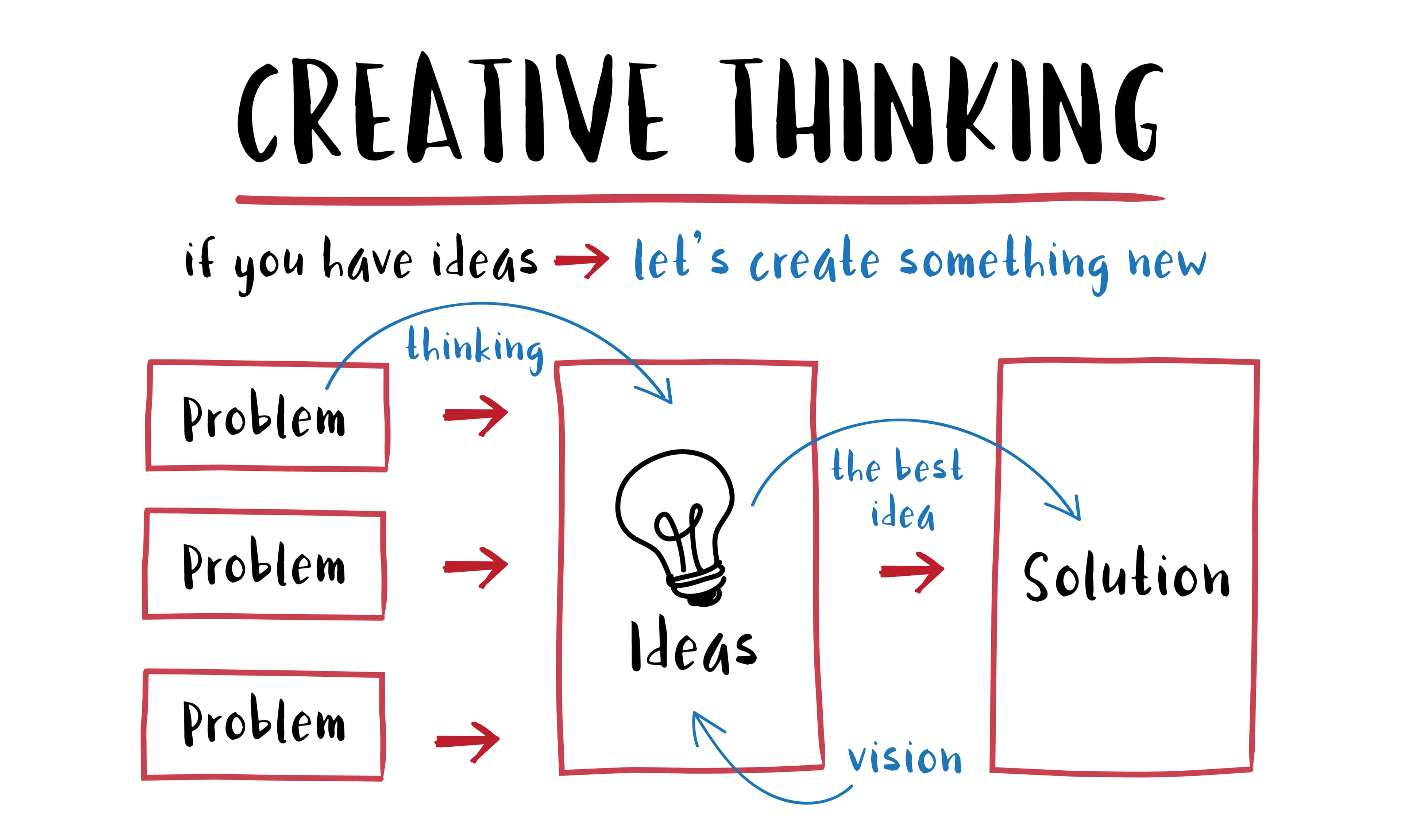
Don Norman's original use of "user experience" was broader than a screen. On a website, you still start with the job to be done, then remove friction. 7 Design Thinking Principles Explained is the process version of that: empathize, define, prototype, test.
Where people mix them up
"We need better UX" when they mean a new look. A restyle without walking the task is UI work wearing a UX label.
"The UX is fine because it looks modern." Modern styling can hide a three-step dead end.
Treating UX as research only. Research without UI still has to become screens. UI without research still has to become a path.
Skipping accessibility. Contrast, labels, and focus order are UX. They show up in the UI.
What to fix first on a real site
If people bounce before they act, do not start with a new illustration set.
Name the one job of the page.
Walk that job on a phone, slowly.
Count pauses (every time you wonder what to click).
Fix labels, order, and missing steps.
Then use UI to make the remaining path obvious: hierarchy, type, contrast.
Step 5 is Visual Hierarchy in Web Design. The full walk is How to Review Your Own Website for UX Issues.
How the two roles work on a small team
On Digital Dialogue-scale sites, one person often does both. That is fine if you split the hat in time:
First pass: path, copy, structure (UX)
Second pass: type, color, spacing, components (UI)
Third pass: walk the path again. Styling should not have created new pauses.
If you hire, ask for examples of a flow they improved, not only a mood board. Pretty frames without a before/after path are UI samples.
Everyday version of the same split
You already judge this split outside the web: a beautiful appliance with a hidden power switch, a stylish tap that scalds, a poster that looks expensive but cannot be read from the street. That is the same idea as Why Design Matters in Everyday Life: form is doing a job, or it is in the way.
Closing takeaway
Use UI for what people see. Use UX for whether they succeed. When a page fails, ask which one broke: the path, or the ranking of the path. Fix the path first, then make the right things easy to see.