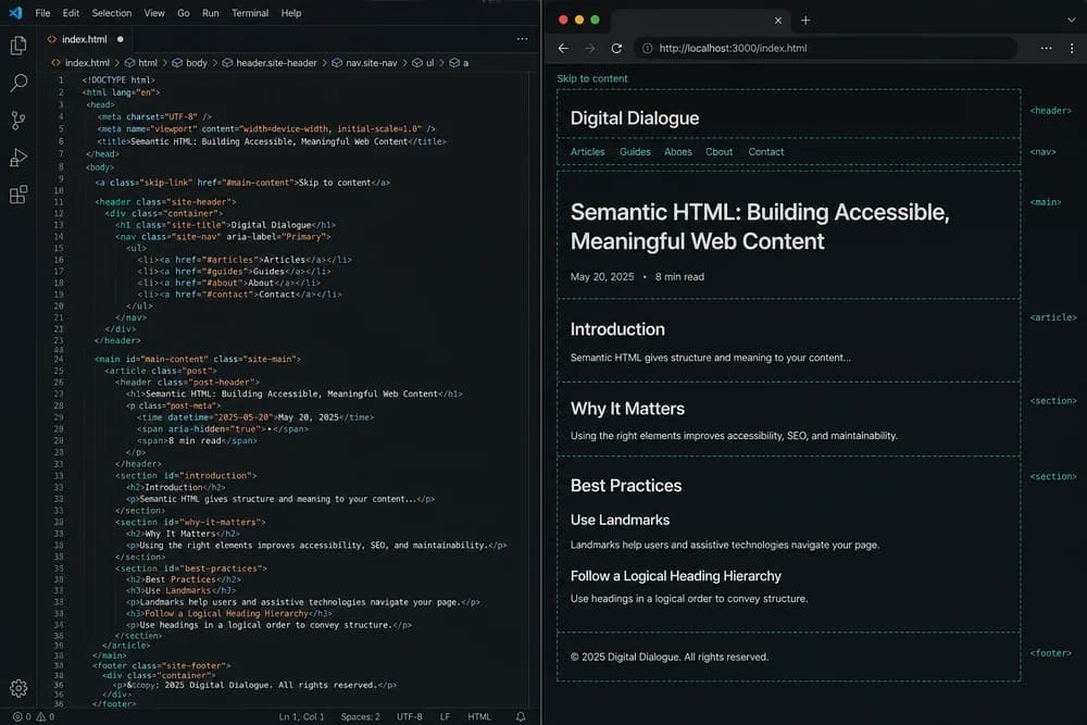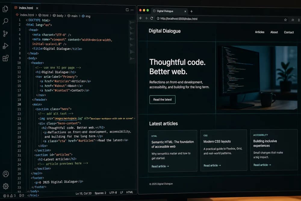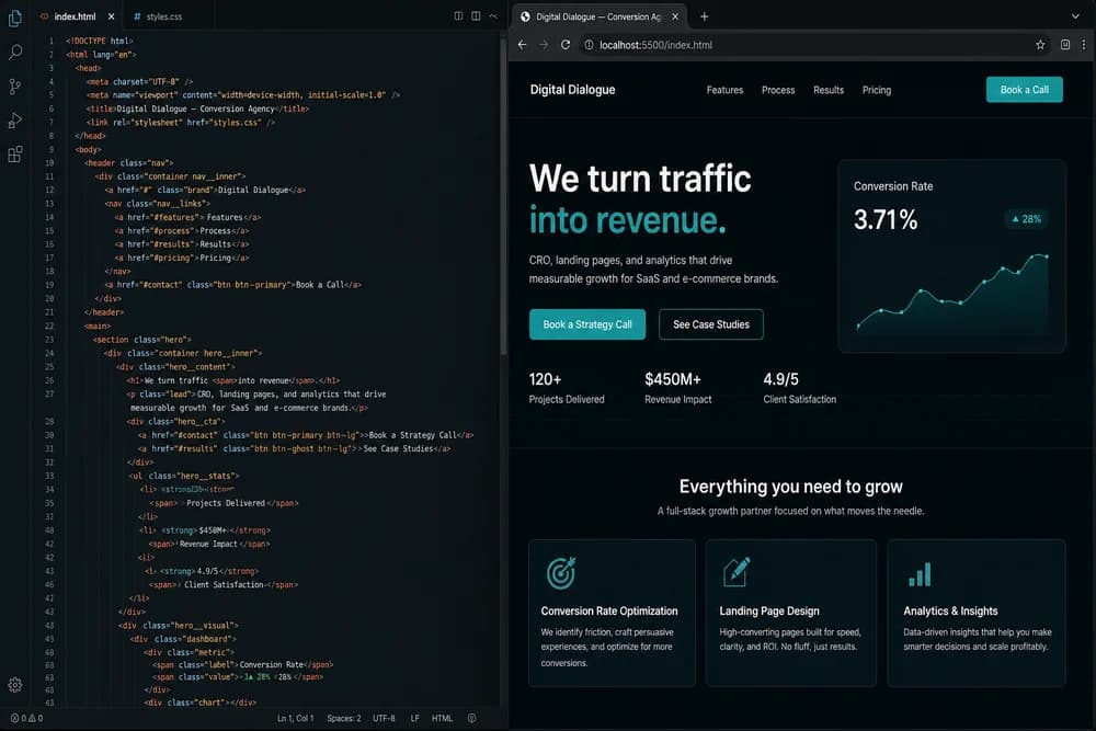
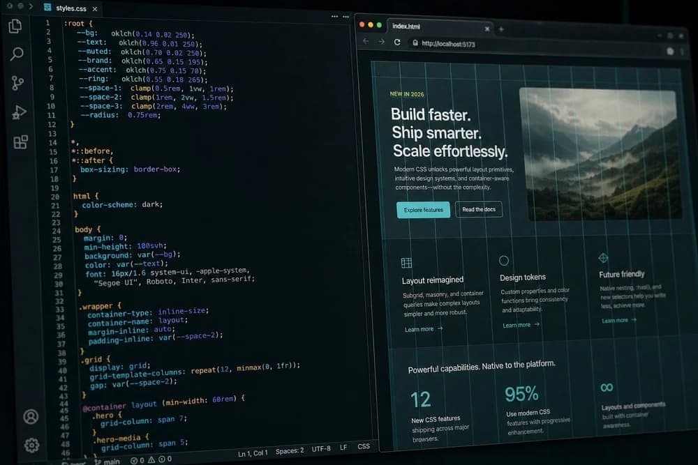
CSS keeps changing, but the core job stays the same: turn structure into clear, usable interfaces that work across screens. If you are learning frontend development in 2026, the fastest path is not chasing every new trick. It is mastering the small set of CSS skills you will use every day, then adding modern features that remove common pain points.
If you are still building your base, start with HTML in 2026: Still Relevant in the Age of AI. Clean structure makes every CSS decision easier.
The CSS fundamentals that still decide project quality
Most broken stylesheets are not broken because developers missed a new feature. They are broken because cascade, sizing, or layout basics were shaky.
Cascade and specificity
You do not need complicated selector chains to write good CSS. You need predictable rules:
Keep specificity low and consistent.
Prefer class selectors for components.
Avoid styling with IDs unless there is a strong reason.
Reduce
!importantto rare utility overrides.
When styles clash, developers often patch with stronger selectors. That works short term, then causes a maintenance mess. Instead, inspect why two rules target the same element and clean up the source of conflict.
Box model and spacing
Even experienced developers lose time to spacing bugs. Set a reliable baseline:
Use
box-sizing: border-boxglobally.Use margin and padding with intent, not by trial and error.
Build a spacing scale, then reuse it.
Keep line length and vertical rhythm readable.
Good spacing is one of the fastest ways to make beginner work look professional.
Typography and readability
CSS is not just layout. It is also reading comfort:
Choose a body font size that works on mobile first.
Set line height for paragraph readability.
Use heading sizes that show hierarchy without giant jumps.
Control max width for long text blocks.
If your text feels hard to scan, users leave, even if the visual design looks modern.
Modern layout in 2026: flexbox, grid, and container queries
The layout stack is now mature. You do not need to pick one approach for everything.
When to use Flexbox
Use Flexbox for one-dimensional alignment:
Nav bars
Button groups
Card headers
Inline control rows
It is perfect when you are mainly arranging items in a row or column and need alignment and spacing control.
When to use Grid
Use Grid for two-dimensional layout:
Page sections
Card galleries
Dashboard blocks
Complex form arrangements
Grid reduces hacks that were common with older techniques. If your layout needs coordinated rows and columns, start with Grid instead of forcing Flexbox.
Why container queries matter now
Container queries are one of the biggest practical upgrades for component-based development. Instead of styling a card based on viewport width, you style it based on the width of its parent container. That means one component can behave correctly in a sidebar, a main content column, or a modal without custom overrides.
For beginners, this removes a common confusion: "It looked fine on the page I tested, why did it break when reused?" Container-aware components are more portable.
Responsive design now means fluid systems, not only breakpoints
Breakpoints are still useful, but they are only one part of responsive design.
Prefer fluid sizing where possible
Modern CSS gives you tools like clamp() to create values that scale smoothly between minimum and maximum bounds. This is great for:
Heading sizes
Section spacing
Container widths
Fluid values reduce the number of media queries you need and make transitions between screen sizes feel more natural.
Use media features for user preferences
Responsive design includes accessibility preferences:
prefers-reduced-motionfor users sensitive to motionprefers-color-schemefor light and dark themesContrast-aware color decisions
If you only design for screen width, you miss important real-world needs.
Maintainable CSS beats clever CSS
Teams do not struggle with CSS because it is weak. They struggle because the stylesheet becomes inconsistent.
Use a naming and file strategy
Pick an approach and stick to it:
Component-scoped files
Utility-first classes
BEM-like naming
Layered architecture
The best system is the one your team can apply consistently after three months, not just the one that looked clean in week one.
Use custom properties for design tokens
CSS custom properties are now standard practice for shared values:
Colors
Spacing scale
Typography sizes
Border radius
This keeps theme changes and design updates manageable. Instead of updating 80 hardcoded values, you update a small token set.
Keep overrides intentional
If you keep writing "temporary" overrides, pause and refactor. A small cleanup now saves major debugging later. Style bugs are often architecture bugs in disguise.
What beginners should skip for now
A practical learning path includes knowing what not to focus on early.
Skip or delay:
Obscure selector tricks you cannot explain
Advanced animation setups before mastering layout
Framework-specific CSS abstractions before core CSS understanding
Premature optimization of tiny style details
Build confidence with real components first. Fancy techniques make more sense after you have solved common interface problems repeatedly.
A realistic CSS learning roadmap for 2026
If you are new or restarting, this sequence works well:
Step 1: Build static pages with clean HTML and basic CSS
Use semantic structure, then style it. This pairs well with Semantic HTML Checklist for SEO and Accessibility.
Step 2: Master Flexbox and Grid through component builds
Create:
Navbar
Feature section
Pricing cards
Footer
Do not just copy tutorials. Rebuild from memory, then compare.
Step 3: Add responsive behavior with fluid values and media queries
Test on narrow and wide viewports. Fix overflow, text scaling, and spacing.
Step 4: Introduce custom properties and a spacing/type scale
Refactor your previous project to use tokens. You will learn maintainability faster than by starting from a blank "perfect" setup.
Step 5: Build one complete page without JavaScript
A strong exercise is a conversion-focused page like this guide: How to Build a Landing Page with Only HTML and CSS.
Common CSS mistakes that still hurt projects
Even in 2026, the same mistakes appear:
Setting fixed heights where content should grow
Ignoring overflow and text wrapping
Mixing too many units without a clear system
Copying snippets without understanding side effects
Styling around broken HTML structure
If this sounds familiar, review Common HTML Mistakes Beginners Make (and How to Fix Them). Many CSS bugs start in markup decisions.
A quick self-review before shipping CSS
Before you call a page complete, run a short CSS review:
Check layout at narrow, medium, and wide widths
Confirm text remains readable without zooming
Verify interactive states are visible (hover, focus, active)
Scan for duplicate rules that should become shared utilities
Remove one-off overrides that hide architecture issues
This 10-minute pass catches most beginner-level regressions and helps your stylesheet stay predictable as the project grows.
Where JavaScript fits into your frontend growth
CSS handles presentation and a surprising amount of interaction states, but many products need dynamic behavior. Once your CSS base is stable, continue with JavaScript for Beginners in 2026: What to Learn First so you can connect interface structure, styling, and behavior in one workflow.
Focus on depth over novelty. In 2026, developers who write clean, predictable CSS are still rare, and still valuable. If you can build responsive layouts, maintain a design system, and avoid cascade chaos, you already have a skill that teams actively need.