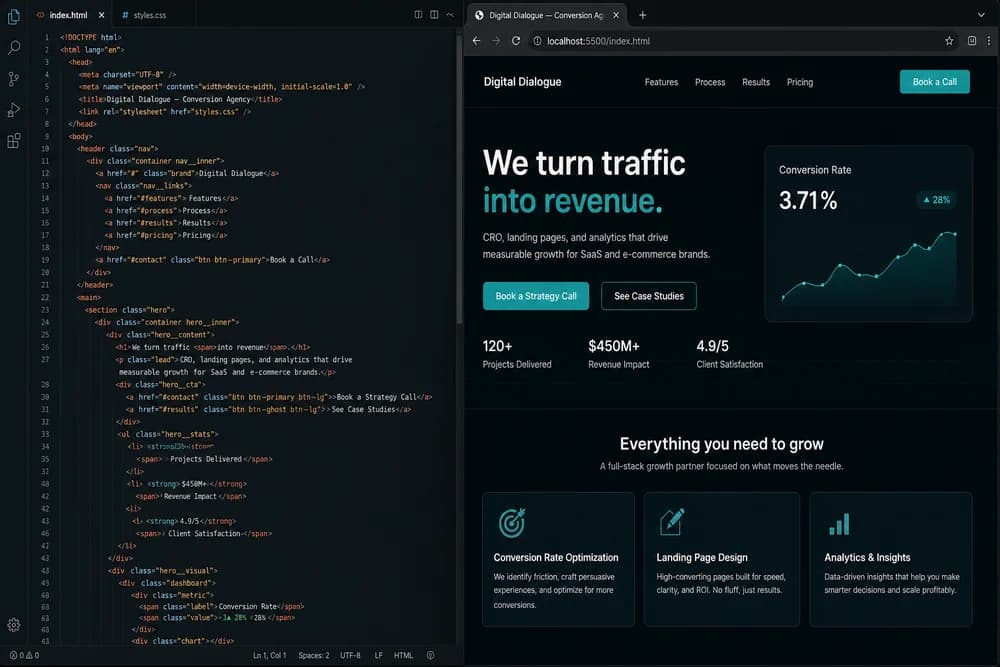
Building a landing page with only HTML and CSS is one of the best beginner projects in frontend development. It teaches structure, layout, typography, spacing, and responsive design without hiding behind frameworks. You also learn a key professional skill: making a page clear enough to convert users with simple tools.
If you are unsure why markup quality matters before styling, start with HTML in 2026: Still Relevant in the Age of AI.
What a landing page needs to do
A landing page is not a full website. It has one main goal, such as collecting emails, booking calls, or driving signups. Everything on the page should support that goal.
For beginners, this means avoiding feature overload. You do not need sliders, complex interactions, or heavy effects. You need clarity.
Plan content before writing code
Before opening your editor, define:
Primary audience
Primary action (the call to action)
Top problem you solve
Proof points you can show honestly
This content-first step prevents random sections that look nice but do not help users decide.
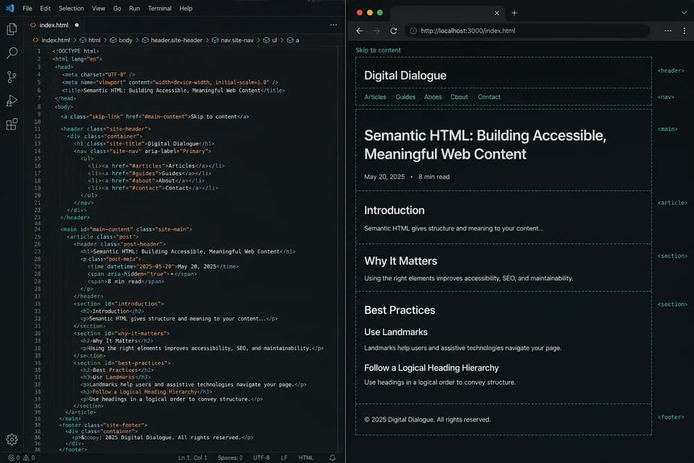
Build semantic HTML structure first
Start with meaningful sections in this order:
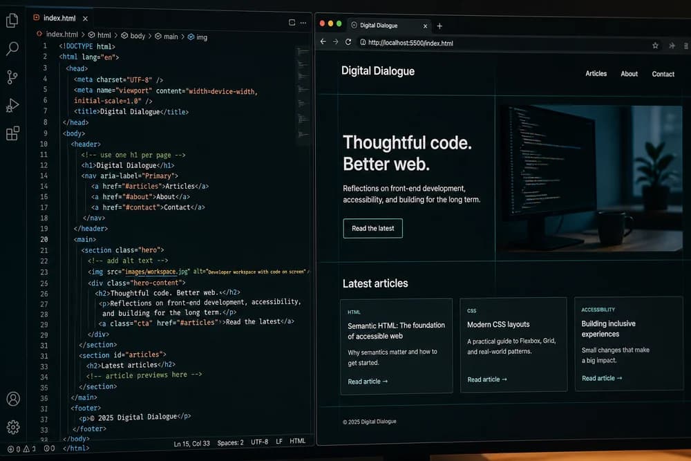
Header with brand and simple nav
Hero section with headline, short value statement, and primary CTA
Benefits or features section
Social proof or trust indicators
Final CTA section
Footer with basic links
Use semantic elements where possible:
headermainsectionfooter
For a detailed quality pass, run the Semantic HTML Checklist for SEO and Accessibility before styling heavily.
Write hero copy that converts without hype
The hero does the hardest work. It should answer three questions quickly:
What is this?
Who is it for?
What should I do next?
Keep it short:
Clear headline
One supporting paragraph
One strong CTA button
Avoid vague claims like "best solution" unless you can prove them on-page.
Style system: keep your CSS small and consistent
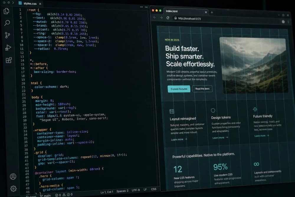
Instead of writing random values, define a small visual system:
Font stack
Color palette
Spacing scale
Border radius style
Button style variants
If you want deeper guidance on modern styling priorities, review CSS in 2026: What Still Matters.
Use layout primitives intentionally
For this type of page:
Use Flexbox for nav rows, button groups, and simple alignments.
Use Grid for feature cards and multi-column sections.
Use max-width containers to keep text readable.
Most layout issues come from unclear container rules, not from missing advanced CSS features.
Make it responsive from the start
Do not build desktop first and patch mobile later. Start with mobile-friendly defaults:
Single-column flow
Readable text sizes
Generous tap targets
Balanced vertical spacing
Then enhance for larger screens with media queries. If sections break, simplify structure before adding more CSS rules.
Build high-impact sections with minimal code
Benefits section
Use 3 to 6 short benefit cards. Each card should include:
Short title
One practical outcome
Optional icon or visual cue
Keep claims specific. "Save setup time" is stronger than "Boost efficiency."
Trust section
Without JavaScript, you can still build trust:
Client logos
Brief testimonials
Security or guarantee notes
Process summary
Only include proof you can stand behind. Do not add fake numbers or made-up endorsements.
CTA section
End with one clear action. Repeat your core value briefly, then present a single button. Too many options reduce conversions.
Accessibility and usability checks
A clean landing page is not only visual. Run these checks:
Heading hierarchy makes sense
Link and button text is descriptive
Form fields have labels
Color contrast is readable
Keyboard navigation reaches all actions
Many conversion problems are actually usability problems. Fixing semantics and clarity often improves results more than visual effects.
If you keep running into structural issues, review Common HTML Mistakes Beginners Make (and How to Fix Them).
Simple SEO support without over-optimizing
Even a basic landing page should have:
Accurate title
Clear meta description
Logical heading structure
Relevant internal links
Do not force keywords into every sentence. Write naturally for the target reader and keep section intent obvious.
Conversion copy checklist for beginner pages
Code structure matters, but copy quality often decides whether users click your CTA. Use this checklist while writing section text:
Headline explains the main benefit in plain language
Subheading clarifies who the offer helps
CTA uses action language like "Start free trial" or "Book a demo"
Benefits describe outcomes, not feature names only
Trust section removes common objections
If users cannot quickly explain your offer back to you, simplify the wording.
Pre-launch checks before you share the page
Before publishing or sending the page to feedback reviewers, run a practical final pass:
Content clarity check
Every section supports the main conversion goal
No off-topic blocks added just for visual balance
CTA text is consistent across hero and final section
Visual consistency check
Spacing values follow your defined scale
Buttons and cards use shared component styles
Typography hierarchy is consistent from top to bottom
Device and interaction check
Core flow works on small and large screens
Forms can be completed with keyboard only
Important text does not wrap awkwardly at common widths
This last pass prevents avoidable issues that make beginner projects look unfinished.
A practical build workflow for beginners
Use this sequence to avoid chaos:
Step 1: Write raw HTML section by section
Do not style every line immediately. First verify that the content order and structure make sense.
Step 2: Add base CSS tokens and layout utilities
Set fonts, spacing, container width, and primary colors first.
Step 3: Style components in order of importance
Hero, CTA, then supporting sections. Prioritize what affects user decisions most.
Step 4: Test on multiple screen widths
Check readability, spacing, and button usability. Fix overflow and stacking issues.
Step 5: Final pass for clarity and consistency
Tighten text, confirm CTA language, and remove any visual noise that distracts from the main action.
Should beginners add JavaScript later?
Yes, but only after the HTML and CSS page already works. Add JavaScript to improve, not rescue, the experience.
Good first enhancements:
Form validation
Smooth section navigation
Dynamic content blocks if needed
If you are ready for that stage, use JavaScript for Beginners in 2026: What to Learn First to add behavior without overcomplicating your project.
Final takeaway
A strong landing page does not require complex tools. It requires clear structure, thoughtful copy, consistent CSS, and focused user flow. Build one full page end to end with only HTML and CSS, refine it with real usability checks, and you will gain skills that transfer directly to larger frontend work.