
Margin and padding both create empty space. They do different jobs. Mixing them up is why buttons look tiny, sections stick together, and forms feel cramped even after you "add spacing."
This is a practical box-model pass for people shipping pages, not a CSS textbook. If you need page-level empty areas and grouping next, read How to Use White Space in Web Design. For text rhythm inside those boxes, use Line Height and Spacing: Make Text Easier to Read.
The one-line difference
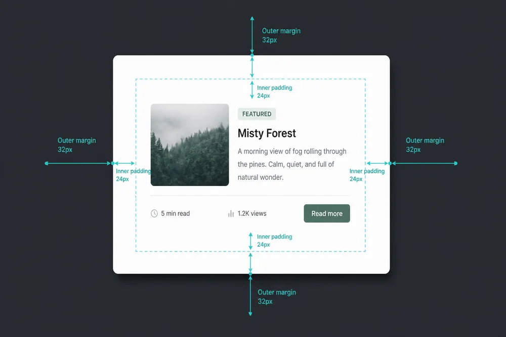
Margin sits outside the border. It pushes this box away from other boxes.
Padding sits inside the border. It pushes the content away from the edge of this box.
Border is the wall. Margin is the yard. Padding is the room inside.
If two cards are stuck together, you usually need margin (or gap) between them. If the text inside a card touches the edge, you need padding inside the card.
Why the difference matters on real pages
Teams often raise padding everywhere when the real problem is between sections. The card gets a huge interior and neighboring sections still collide. Or they add margin inside a button mentally and ship a control with no tap room.
Wrong tool, wrong fix:
Padding between sections → sections look fat, still may collapse oddly with neighbors
Margin inside a button (instead of padding) → the clickable area stays small while the layout shifts
Huge padding on a full-width band → content floats, but nested cards still crush their text
Get the job right first. Then tune the number.
Use margin (or gap) to separate things
Use outside space when you want distance between:
Sections on a landing page
Cards in a row or stack
Form fields as separate questions
A heading block and the previous section
In modern layouts, gap on flex or grid often replaces repeating horizontal margins between siblings. The job is the same: space between items, not inside them.
Vertical margin collapse (the surprise)
In normal document flow, adjacent vertical margins can collapse into one. Two blocks with margin-bottom: 24px and margin-top: 24px may show 24px total, not 48.
That is why "I doubled the margin" sometimes does nothing visible. Padding, borders, and flex/grid gaps do not behave the same way. If your section spacing never seems to grow, check collapse before you keep adding numbers.
Use padding to protect content inside a box
Use inside space when you need:
Text off the edge of a card
Comfortable tap area on a button
Typed text room inside an input
Breathing room inside a colored band or alert
Padding is part of the component. It travels with the box. That is why a button with good padding still feels usable when you move it.
Forms: both tools, two jobs
Forms fail when one spacing value does both jobs.
Padding inside fields so typed text is not crushed against the border
Margin or gap between fields so each question reads as separate
Label near its field (small gap), then larger space before the next field
That matches the grouping rule used for headings in Line Height and Spacing: Make Text Easier to Read: related items sit closer than unrelated ones.
Buttons and tap targets
A button's clickable comfort comes mostly from padding, not from the font size alone. Tiny padding with large type still feels hard to hit on a phone.
Separate the button from other controls with margin or gap outside. Do not replace padding with outer margin and expect the tap area to grow.
If your landing page still feels busy after box spacing is correct, the problem may be competing CTAs and repeated blocks. Run How to Reduce Clutter on a Landing Page.
Cards, sections, and "everything is a box"
Think in layers:
Page sections: separated by margin or section padding patterns that create clear breaks
Cards / panels: padding inside so content clears the edge; margin or gap between cards
Controls: padding for hit area; margin between controls
Text: line height and paragraph gaps inside the content, not fake empty CMS paragraphs
Hierarchy still ranks what people see first. Spacing keeps those ranks readable. See Visual Hierarchy in Web Design: A Practical Guide.
Mobile is where the mix-up shows
Desktop padding that looks generous can become a narrow, cramped column on phones when:
Side padding is too large for the viewport
Nested cards each add padding
Fixed-width assumptions leave no room for content
When that happens, reduce nested padding, keep a usable content width, and preserve margin between sections so the page does not become one brick. Details live in Mobile Spacing: Why Desktop Padding Breaks on Phones.
A quick diagnosis checklist
Symptom | Likely fix |
Text touches card edge | Increase padding inside the card |
Two sections stuck together | Increase margin/gap between sections |
Button hard to tap | Increase padding inside the button |
Fields feel like one blob | Increase gap between fields; keep label close to its field |
"I added margin and nothing changed" | Check vertical margin collapse or a parent with gap already set |
Page looks fat but still noisy | You may need decluttering, not more padding |
If people still cannot finish the task after boxes look correct, walk the flow with How to Review Your Own Website for UX Issues. Spacing cannot fix a confusing path.
A short spacing pass
Name each empty area: inside a box, or between boxes?
Fix insides with padding (cards, buttons, inputs).
Fix between-ness with margin or gap (sections, fields, cards).
Attach labels and headings to what they own with a smaller gap than the gap to the next group.
Check one form and one card row on a phone.
Only then tune page-level white space and clutter.
Closing takeaway
Margin separates boxes. Padding protects content inside a box. Choose by job, not by habit. If you only change one thing this week, open your signup form: give every field real inner padding, then add clear gap between fields so each question stands alone.