
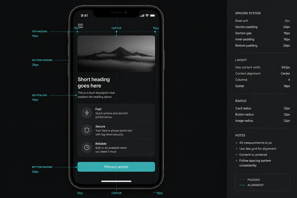
A layout can look calm on a wide monitor and fail on a phone for one reason: the same padding, max-width, and section gaps were built for a screen that has extra room. On a phone, that extra room is gone. The padding starts eating the content.
This is a spacing problem, not a "make the font smaller" problem. The wider idea lives in How to Use White Space in Web Design. This article is what changes at a narrow width, and how to fix it without breaking grouping or tap targets.
What desktop padding is doing
On desktop, large side padding creates a reading column. That is useful. The empty sides are macro white space: they push content inward so lines stay comfortable and the page feels open.
On a phone, the viewport is already the column. If you keep 48px or 64px side padding, body text becomes a skinny strip. Line length gets worse, not better. Buttons sit inset from the thumb. Cards feel like postage stamps with huge empty borders.
Outer padding should shrink. Inner grouping should stay. A heading still belongs closer to its paragraph than to the previous section. That relationship does not change just because the screen got narrower.
A quick mental model
Outer frame (page side padding, section top/bottom): scale down on small screens.
Inner groups (heading to body, label to field, items in a list): keep tight relationships.
Between sections: keep a clear pause, but you can use a smaller gap than desktop.
If you shrink everything equally, you lose hierarchy. If you shrink nothing, you crush the content.
Type and space have to move together
If you only shrink padding and leave a desktop heading size, the title can overflow or wrap into a wall of stacked words. If you only shrink type and leave desktop section gaps, the page feels like sparse posters with tiny text.
On mobile:
Body must stay readable without pinch-zoom
Line height still needs to track lines cleanly (see Line Height and Spacing: Make Text Easier to Read)
Section gaps can be smaller than desktop, but they must still exist
Display headings can drop a step; body should not drop into illegible territory
Typography Basics for Non-Designers covers the type half. Pair it with this spacing pass: size and space are one system on a phone.
Line length on a phone
Very long lines are rare on phones. Very short lines are common when side padding is too large. Short lines force more vertical scrolling and make the eye jump more often. Prefer enough content width for comfortable reading, with a modest edge inset so text does not touch the glass.
Tap targets need space, not only size
Buttons that sit on the screen edge or against each other get mis-taps. Space around a primary action is part of hierarchy. Visual Hierarchy in Web Design: A Practical Guide still applies: one action should look like the action, with room around it.
On a phone:
Give the primary button padding inside (for a usable hit area)
Give it margin outside (so it is not flush against another control or the viewport edge)
Stack secondary actions with a clear gap, not as twin equal buttons fighting for the same tap
Do not rely on desktop hover states that do not exist on a phone. What looks fine with a mouse often fails with a thumb.
Forms suffer the same way. Labels should sit near their fields. Fields should have clear gaps between questions. If typed text feels crushed inside an input, that is inner padding. If fields feel like one blob, that is gap between boxes. See Margin vs Padding: What's the Difference?.
Sections that were side by side become a tall brick
Two-column feature rows become one long column. If each block kept desktop-sized padding, the phone page becomes an endless stack of identical pads. Readers scroll through sameness and lose the page job.
Fix the stack:
Reduce internal padding in cards when they stack full width
Keep a clearer pause between sections than inside every tiny card
Avoid equal padding that makes every module feel identical
If the stack is still too long after spacing is sane, you have clutter. Cut modules using How to Reduce Clutter on a Landing Page. Spacing cannot rescue a page that asks for five jobs at once.
Sticky bars and chrome
Mobile chrome (sticky nav, cookie bars, chat widgets, bottom CTAs) steals vertical space. Large desktop section gaps plus sticky UI leave almost no room for content. Audit floating UI on a real phone, not only in a desktop resize handle.
Margin and padding on small screens
If a box will not shrink the way you expect, you may be padding the wrong edge.
Content space inside the box is padding
Space between boxes is margin (or gap in flex/grid)
Mixing them is why "I reduced spacing" does nothing. You may have lowered margin while padding still locks the inner size, or the reverse. Margin vs Padding: What's the Difference? is the box-model half of this article.
Also watch nested padding: page padding + card padding + inner content padding can leave a tiny text column even when each value "looks fine" alone.
A mobile spacing checklist
Open the page at phone width (or a real device):
Side padding: enough to avoid edge-to-edge text, not so much that lines get tiny.
Body size and line height: readable without pinch-zoom; no colliding lines.
Primary button: not flush to the viewport; not competing with a second equal button.
Card padding: smaller than desktop if cards stack full width.
Section breaks: still readable as a new thought, without desktop-sized voids.
Forms: label near field; clear gap between fields; usable input padding.
Sticky chrome: content still usable with bars visible.
Then walk the real job using How to Review Your Own Website for UX Issues. Spacing that looks pretty in a screenshot can still fail a checkout or signup flow.
What good looks like
After a solid mobile pass:
Text has a comfortable column, not a skinny strip
Headings still own the text below them
Buttons are easy to tap without mis-hits
Stacked cards do not inflate into endless empty pads
Section changes are obvious without wasting the whole viewport
Nested boxes do not steal the content width
You should not need a design critique to feel the difference. Reading and tapping get quieter.
Closing takeaway
Do not copy desktop padding onto a phone. Shrink the outer frame, keep grouping, keep readable type, and give the main action room to tap. If it is still a brick, you have too many blocks, not too little CSS. If you only change one thing this week, open your landing page on a phone and cut side padding until the body column is readable again, then recheck the primary button.