
Line height and the gaps around headings decide whether people can read a page without working for it. Size gets the attention. Spacing keeps the reading going.
This is for people who ship articles and landing pages, not type theory. You should be able to open a live page after reading and fix the rhythm in one pass. If the layout around the text still feels packed at the section level, read How to Use White Space in Web Design. If you still need a type scale before you tune space, start with Typography Basics for Non-Designers.
Why spacing beats another font swap
When text feels hard to read, teams often change the font first. That sometimes helps. More often the real problem is vertical rhythm: lines that collide, headings that float between sections, and paragraphs jammed into one brick.
Spacing fixes are cheaper and clearer than a full type redesign. They also support hierarchy. Size and weight rank the text. Space keeps that rank readable. That pairing is the same idea behind Visual Hierarchy in Web Design: A Practical Guide.
Line height is for tracking the next line
Line height is the vertical measure of a line of text, including the glyphs and the room above and below them. Readers use that room to find the start of the next line.
If lines sit too close, the eye loses its place and rereads the same line. If they sit too far, a paragraph turns into a stack of captions and the page feels sparse even when the content is fine.
A practical phone check
Open a long paragraph on your phone.
If you keep rereading the same line, raise line height.
If the paragraph feels like a list of one-liners, lower it slightly.
If you must pinch-zoom to read, fix size first, then return to line height.
Do the line-height check before you blame the font. Many "this font is hard to read" reports are spacing.
Body vs display
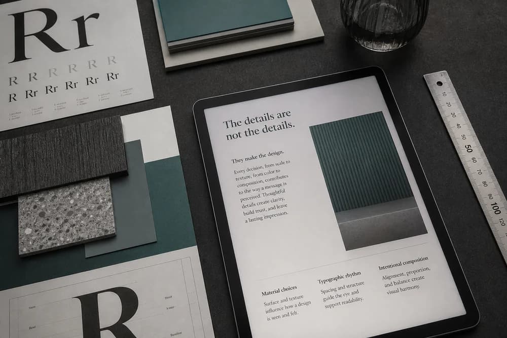
Body text needs enough line height for continuous reading. Display headings can sit tighter because they are short. Do not force one line-height token onto every text style on the site.
Headings belong to the text below them
A heading that is equally far from the section above and the paragraph below does not belong to either. Readers cannot tell what it introduces.
Use a smaller gap under the heading than above it. The heading should look attached to its content.
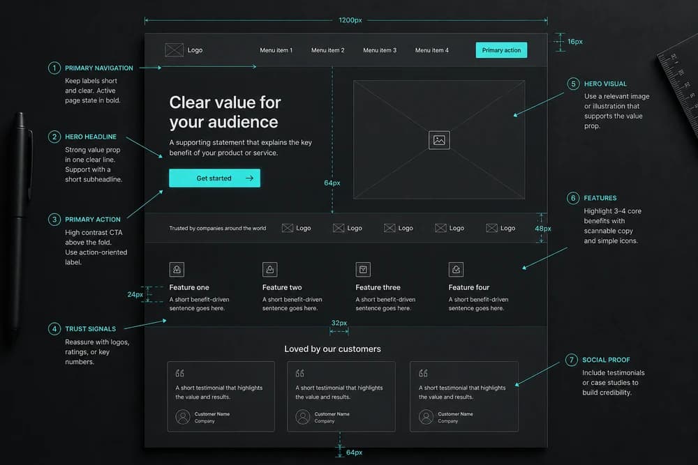
That is grouping, which is also a hierarchy rule. Related items sit closer together than unrelated ones. If every block uses the same gap, the page has no groups, only a stack.
Common heading mistakes
The same margin above and below every H2
Huge space under the title, then the first paragraph pushed into the fold
H2s that sit closer to the previous section than to the text they own
Extra blank lines in the CMS used as "air," which break the first time someone edits the copy
Fix the relationship, not the decoration.
Paragraphs need a pause, not a new layout
One consistent space between paragraphs is enough for most articles. That pause tells the reader a thought ended. It should not look like a new section break.
Do not add empty paragraphs in the CMS to create air. Empty paragraphs are fragile. The next edit deletes one and the rhythm collapses.
For lists:
Keep items closer to each other than the list is to the next heading
Treat the list as one thought
Avoid huge gaps between every bullet unless each item is a full mini-section
UI text is tighter than article text
Buttons, nav, and form labels need less line height than a blog paragraph. They are short. Article body needs more room because people read it in longer stretches.
Do not copy your article line height onto buttons. Do not copy button tightness onto a 400-word section.
Forms need two spacing jobs
Inside a field, padding gives the typed text room. Between fields, margin (or gap) separates questions. If fields still feel cramped after line height is fine, the issue is often the box, not the text. See Margin vs Padding: What's the Difference?.
Labels should sit nearer their field than to the next field. That is the same heading rule applied to forms.
Line length and spacing work together
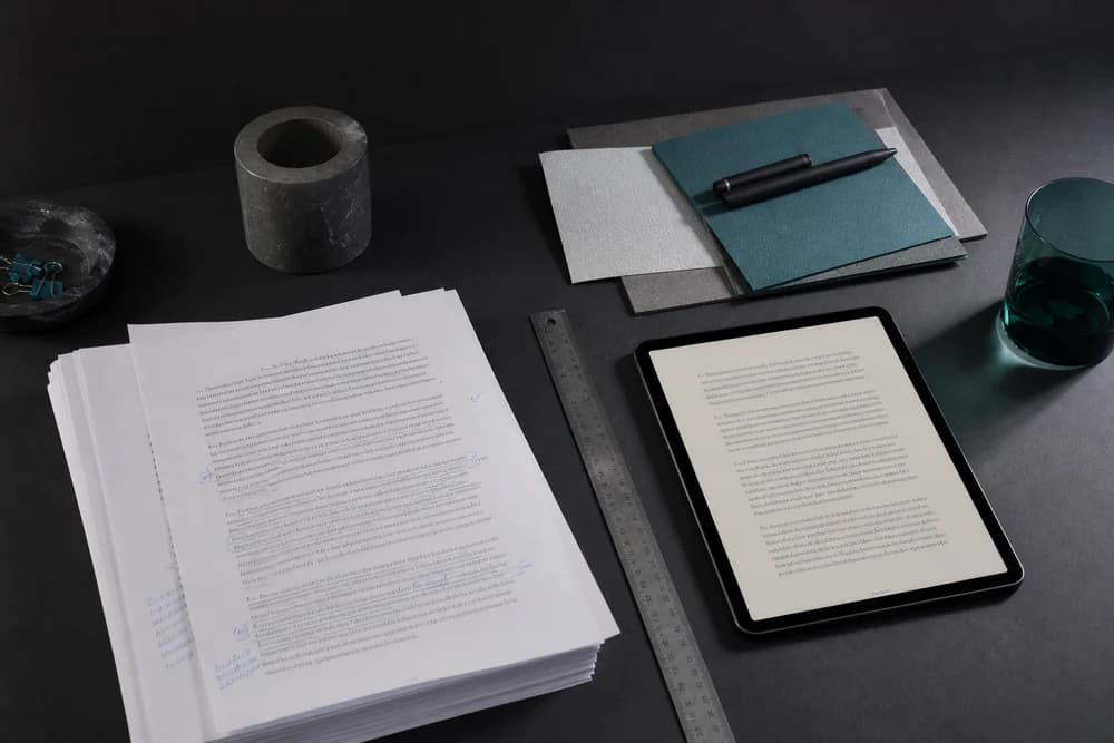
Very long lines make even good line height harder. The eye travels too far to find the next line. A comfortable reading column helps spacing do its job.
You do not need a perfect measure on day one. Avoid full-bleed paragraphs on a huge monitor. If the line is extremely long, tighten the column before you keep raising line height.
A short text-spacing pass
Run this on one article or landing block:
Set one body size and stick to it for that page type.
Raise line height until lines no longer collide on a phone.
Put a heading closer to its paragraph than to the previous section.
Use one paragraph gap and stop adding blank lines in the CMS.
Check a form: label near field, more space between fields than inside a field.
Check buttons and nav separately with a tighter line height.
Open the same page on a phone and confirm you can track lines without rereading.
If the page still feels like one long brick after text rhythm is fixed, the problem has moved to section-level space or clutter. Use How to Use White Space in Web Design and How to Reduce Clutter on a Landing Page. On small screens, also check Mobile Spacing: Why Desktop Padding Breaks on Phones.
When spacing will not save the page
Readable spacing cannot fix:
A page with no clear job
Labels nobody understands
Three primary buttons competing
A path that still makes people guess
Those are UX problems. Walk the task with How to Review Your Own Website for UX Issues, and keep Why UX Matters More Than Looks in Web Design in mind: prettier text on a broken path is still a broken path.
What good looks like
After a solid pass:
Body lines are easy to follow on a phone
Each heading clearly owns the text below it
Paragraphs pause without becoming section breaks
Lists read as one unit
Buttons and labels stay compact
Forms separate questions without crushing the typed text
You should not need a design critique to feel the difference. Reading gets quieter.
Closing takeaway
Make body lines easy to follow, then attach each heading to the text it introduces. That is most of readable spacing. Tune UI text separately, keep one paragraph rhythm, and only then widen to page-level empty areas. If you only change one thing this week, open your longest article on a phone and raise line height until you stop losing the next line.