
Clutter on a landing page is not "too much design." It is too many jobs fighting for the same attention. People arrive with one question. The page answers five, then asks for three clicks.
This guide is a removal pass, not a redesign brief. You should be able to open a live landing page, cut competing noise, and leave one clear path. If the page still feels packed after you remove extras, the leftover problem is often spacing and grouping. Pair this with How to Use White Space in Web Design and Visual Hierarchy in Web Design: A Practical Guide.
What clutter actually is
Clutter is anything that competes with the page job:
A second primary CTA next to the first
Nav items that send people away before they convert
Feature lists that repeat the same benefit in new words
Badge rows, popups, chat widgets, and sticky bars all at once
Sections that exist because "every landing page has one," not because this offer needs them
Empty space alone does not fix that. If five messages still shout, the page stays noisy even with padding.
Start with the one job
Write the page job in one sentence before you edit.
Examples:
Book a demo for teams that already use our tool
Buy the starter plan for freelancers
Download the checklist for first-time founders
Everything on the page either supports that sentence or fights it. If you cannot name the job, every section will invent its own.
This is also a UX rule. Looks without a clear path still fail. Keep Why UX Matters More Than Looks in Web Design in mind while you cut.
Cut competing actions first
One primary action. One visual weight for that action.
Secondary actions can exist, but they should look quieter: text link, ghost button, or a lower placement. Two equal "Buy now" and "Learn more" buttons in the hero is clutter, even if the layout is clean.
Nav and exit ramps
A full marketing nav on a conversion page is often the loudest distraction. People click "Blog," "Pricing," or "About" and never return.
Options that usually work:
Minimal nav with logo and one contact or login link
Sticky CTA that matches the page job, not a second product
Footer links for legal and secondary destinations
Do not hide needed trust links. Do remove the tour of the whole site from the first screen.
Remove repeated proof and filler sections
Social proof helps when it answers doubt near a decision. It hurts when it stacks:
Logo strip
Then three testimonials
Then a stats bar
Then another logo strip
Then "as seen in"
Pick one proof format for the main doubt. Place it near the CTA that needs trust. Cut the rest or move it lower as a short supporting block.
The same rule applies to feature grids. If six cards say "fast," "easy," and "reliable" with different icons, you have decoration, not clarity. Keep the features that change the buyer's mind. Cut the rest or fold them into one short list.
Make hierarchy do the cutting for you
When size, weight, and space all rank the same, everything looks important. That is clutter by hierarchy failure.
After you remove extras:
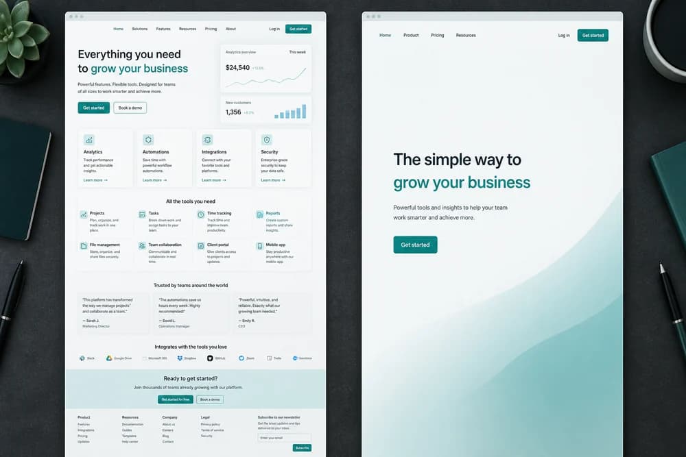
One headline that states the offer
One supporting line
One primary CTA
Proof or detail only after that path is clear
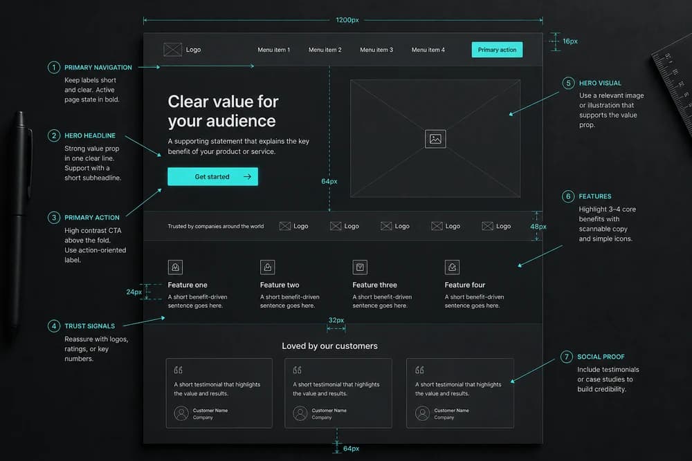
Do not fill the first viewport with stats, schedules, badge clusters, and secondary promos. That pattern is a common reason landing pages feel busy before anyone scrolls. Hierarchy guidance in Visual Hierarchy in Web Design: A Practical Guide applies here directly.
Spacing after the cut
Removing widgets is half the job. The remaining blocks still need room.
Give the hero one job and air around the CTA
Separate sections with consistent gaps so each block reads as one unit
Avoid equal gaps that make every module feel identical
Text-level rhythm matters too. If the remaining copy is hard to read, fix Line Height and Spacing: Make Text Easier to Read before you add more design. Box spacing mistakes (padding inside, margin between) show up in forms and cards; use Margin vs Padding: What's the Difference? when fields still feel crushed.
On phones, desktop padding often collapses into a packed column. Check Mobile Spacing: Why Desktop Padding Breaks on Phones after the desktop cut.
A declutter pass you can run in one hour
Write the one-sentence page job.
Count primary CTAs in the first viewport. Keep one.
Strip or quiet the nav exits that do not support conversion.
Delete one repeated proof block (second logo row, duplicate quote strip).
Merge feature cards that say the same thing.
Kill one widget for the test: popup, sticky bar, or chat. Measure, then decide.
Check the remaining hierarchy: headline, support, CTA, then detail.
Open on a phone. Confirm the CTA is still the clearest action without pinching past noise.
If people still cannot complete the task after the page looks cleaner, the issue may be labels, steps, or flow. Run How to Review Your Own Website for UX Issues.
What not to cut
Do not remove:
The offer itself
The primary CTA
The one proof type that answers the main objection
Legal links people need
Information required to decide (price clarity, plan limits, who it is for)
Decluttering is not starving the page. It is stopping the page from arguing with itself.
What good looks like
After a solid pass:
A stranger can name the page job in five seconds
One action clearly wins visually
Proof supports that action once, near the decision
Sections do not repeat the same claim
Mobile still shows a clear path without stacked sticky UI
You should feel quieter attention, not emptier content.
Closing takeaway
Name the page job, keep one primary action, and remove everything that competes with that path. Then use space and hierarchy so what remains can be seen. If you only change one thing this week, cut the second hero CTA and one repeated proof strip, then retest the conversion step on a phone.