
White space is the empty area around and between elements. On a webpage it is the gap after a heading, the quiet column beside a form, the room around a button. It is not wasted. It tells people what belongs together and what to look at first.
If everything is tight, the page feels like a list of shouts. If everything is loose with no rank, it feels unfinished. The job is to use space on purpose.
This sits next to Visual Hierarchy in Web Design: A Practical Guide. Hierarchy uses size, contrast, type, position, and space. This article is the spacing lever.
What white space is doing
People scan. Space helps them:
See the page title before the nav noise
Group a heading with the paragraph that belongs to it
Find the primary action
Rest between sections so the next block feels new
That is a UX job, not a style trick. A pretty layout that still makes people guess the next click has failed Why UX Matters More Than Looks in Web Design.
You already know this off the web. A packed shelf is harder to shop than a few products with room around them. Same idea as Why Design Matters in Everyday Life.
Micro space vs macro space
Micro space is close-range: letter spacing, line height, the gap between a label and an input, the padding inside a button. It decides whether text is readable and whether a control feels tappable.
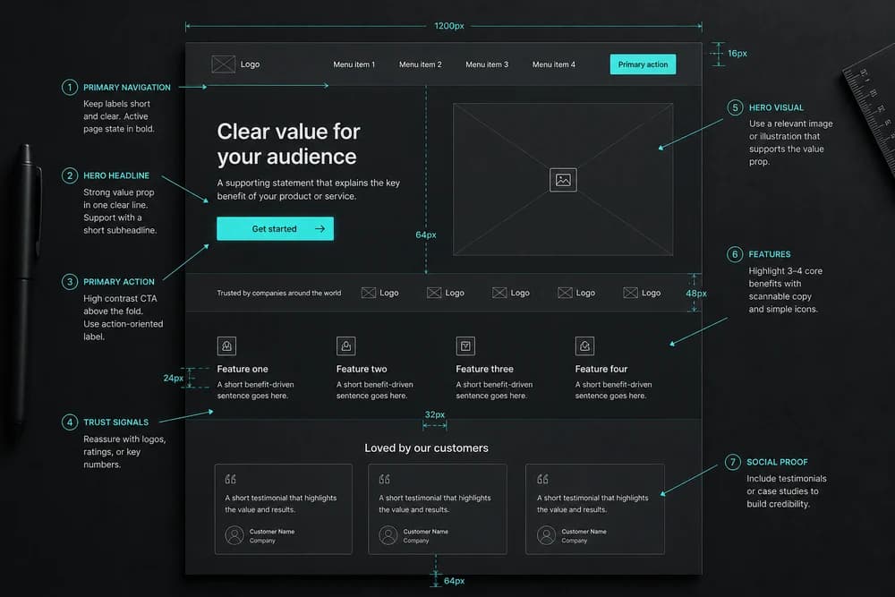
Macro space is section-range: the gap between hero and features, the empty side of a two-column layout, the pause before a footer.
Fix micro space first on articles and forms. Fix macro space when the page still feels like one long brick after type is comfortable.
For line height and the gap after headings, use Line Height and Spacing: Make Text Easier to Read. For the CSS boxes behind the gaps, see Margin vs Padding: What's the Difference?.
A simple rule: isolate the important thing
Pick one thing the visitor should notice first. Give it more space than its neighbors.
Typical first things:
The H1
The primary button
A short proof line under the title
Do not give the same isolation to the newsletter box, three social icons, and a carousel. Equal space is how hierarchy dies.
Group related things by tightening, not by extra lines
Related items should sit closer to each other than to the next group.
A heading should sit nearer its paragraph than to the section above
A label should sit nearer its field than to the next field
A card title should sit nearer its body than to the next card
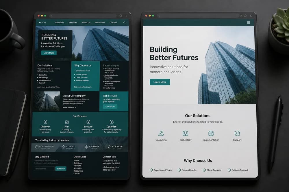
If every block has the same gap, grouping disappears. That is why landing pages with identical padding on every module feel noisy. For a page-level cleanup, see How to Reduce Clutter on a Landing Page.
Do not fill space with extra chrome
When a layout feels empty, people add:
Another icon row
A second CTA
A stock photo that does not support the promise
A background pattern in every section
Add content only if it helps the job. Otherwise enlarge the gap around the real message. Empty area around a clear sentence is usually stronger than a weak extra module.
Color can compete the same way. If the palette is loud, space and type have to work harder. Keep the accent for actions, as in How to Choose a Brand Color Palette and Color Psychology in Branding and Design.
Check it on a phone
Desktop widths hide cramped type. Phone widths hide missing section breaks.
On a phone:
Body lines should not feel glued together
Buttons should not sit on the screen edge
A new section should arrive as a pause, not as more of the same brick
Desktop padding copied straight to mobile often fails. That is covered in Mobile Spacing: Why Desktop Padding Breaks on Phones.
A 10-minute white space pass
Open your most important page.
Name the one thing that should win the first screen.
Add space around it until it is the first thing you still see when you squint.
Tighten the heading to the text that belongs to it.
Increase the gap between unrelated sections until they feel like separate thoughts.
Remove one decorative extra (icon grid, duplicate button, unused sidebar).
Walk the same page on a phone.
If you want this inside a wider UX walk, use How to Review Your Own Website for UX Issues.
Common mistakes
Fear of empty. Teams pack the hero because "above the fold must work harder." One promise plus one action with room around both works harder than five competing claims.
Same gap everywhere. A design system with one padding value for all components cannot group or rank.
Tiny type plus tiny gaps. Raising space without raising type still feels cheap. Type and space move together. See Typography Basics for Non-Designers.
Using space instead of a real structure. Space cannot save a page that has no job. That is UX, not CSS. UI vs UX: What's the Difference? is the split.
Closing takeaway
Use white space to rank and to group. Isolate the one thing that matters, pull related items together, and put a real pause between sections. If a page feels busy, remove one extra module before you add another color. Then check the same layout on a phone.